

Costa Rican Household Poverty Level Prediction
Table of Contents
- 1. Introduction
- 2. Data Wrangling
- 3. Exploratory Data Analysis
- 4. Feature Engineering
- 5. Exploring Household Variables
- 6. Machine Learning Modeling
1. Introduction
The Inter-American Development Bank is asking the Kaggle community for help with income qualification for some of the world’s poorest families.
Here’s the backstory: Many social programs have a hard time making sure the right people are given enough aid. It’s especially tricky when a program focuses on the poorest segment of the population. The world’s poorest typically can’t provide the necessary income and expense records to prove that they qualify.
In Latin America, one popular method uses an algorithm to verify income qualification. It’s called the Proxy Means Test (or PMT). With PMT, agencies use a model that considers a family’s observable household attributes like the material of their walls and ceiling, or the assets found in the home to classify them and predict their level of need.
While this is an improvement, accuracy remains a problem as the region’s population grows and poverty declines. Beyond Costa Rica, many countries face this same problem of inaccurately assessing social need.
Problem and Data Explanation
The data for this competition is provided in two files: train.csv and test.csv. The training set has 9557 rows and 143 columns while the testing set has 23856 rows and 142 columns. Each row represents one individual and each column is a feature, either unique to the individual, or for the household of the individual. The training set has one additional column, Target, which represents the poverty level on a 1-4 scale and is the label for the competition. A value of 1 is the most extreme poverty.
This is a supervised multi-class classification machine learning problem:
- Supervised: provided with the labels for the training data
- Multi-class classification: Labels are discrete values with 4 classes
Objective
The objective is to predict poverty on a household level. We are given data on the individual level with each individual having unique features but also information about their household. In order to create a dataset for the task, we’ll have to perform some aggregations of the individual data for each household. Moreover, we have to make a prediction for every individual in the test set, but “ONLY the heads of household are used in scoring” which means we want to predict poverty on a household basis.
The Target values represent poverty levels as follows:
1 = extreme poverty 2 = moderate poverty 3 = vulnerable households 4 = non vulnerable households
The explanations for all 143 columns can be found in the competition documentation , but a few to note are below:
- Id : a unique identifier for each individual, this should not be a feature that we use!
- idhogar : a unique identifier for each household. This variable is not a feature, but will be used to group individuals by - household as all individuals in a household will have the same identifier.
- parentesco1 : indicates if this person is the head of the household.
- Target : the label, which should be equal for all members in a household
When we make a model, we’ll train on a household basis with the label for each household the poverty level of the head of household. The raw data contains a mix of both household and individual characteristics and for the individual data, we will have to find a way to aggregate this for each household. Some of the individuals belong to a household with no head of household which means that unfortunately we can’t use this data for training. These issues with the data are completely typical of real-world data and hence this problem is great preparation for the datasets you’ll encounter in a data science job!
# Import modules
import pandas as pd
import numpy as np

# Visualization
import matplotlib.pyplot as plt
import seaborn as sns

# Set a few plotting defaults
%matplotlib inline
plt.style.use('fivethirtyeight')
plt.rcParams['font.size'] = 18
plt.rcParams['patch.edgecolor'] = 'k'

# Ignore Warning
import warnings
warnings.filterwarnings('ignore', category = RuntimeWarning)
# Read the data
train = pd.read_csv("train.csv")
test = pd.read_csv("test.csv")
2. Data Wrangling
# Shape of train and test data
print("Train:",train.shape)
print("Test:",test.shape)
Train: (9557, 143)
Test: (23856, 142)
# Let's see some informationof train and test data
train.info()
<class 'pandas.core.frame.DataFrame'>
RangeIndex: 9557 entries, 0 to 9556
Columns: 143 entries, Id to Target
dtypes: float64(8), int64(130), object(5)
memory usage: 10.4+ MB
test.info()
<class 'pandas.core.frame.DataFrame'>
RangeIndex: 23856 entries, 0 to 23855
Columns: 142 entries, Id to agesq
dtypes: float64(8), int64(129), object(5)
memory usage: 25.8+ MB
This tells us there are 130 integer columns, 8 float (numeric) columns, and 5 object columns. The integer columns probably represent Boolean variables (that take on either 0 or 1) or ordinal variables with discrete ordered values. The object columns might pose an issue because they cannot be fed directly into a machine learning model.
The test data which has many more rows (individuals) than the train. It does have one fewer column because there’s no Target!
### Null and missing values
# Check for Null values
train.isnull().sum()
Id                    0
v2a1               6860
hacdor                0
rooms                 0
hacapo                0
v14a                  0
refrig                0
v18q                  0
v18q1              7342
r4h1                  0
r4h2                  0
r4h3                  0
r4m1                  0
r4m2                  0
r4m3                  0
r4t1                  0
r4t2                  0
r4t3                  0
tamhog                0
tamviv                0
escolari              0
rez_esc            7928
hhsize                0
paredblolad           0
paredzocalo           0
paredpreb             0
pareddes              0
paredmad              0
paredzinc             0
paredfibras           0
                   ...
bedrooms              0
overcrowding          0
tipovivi1             0
tipovivi2             0
tipovivi3             0
tipovivi4             0
tipovivi5             0
computer              0
television            0
mobilephone           0
qmobilephone          0
lugar1                0
lugar2                0
lugar3                0
lugar4                0
lugar5                0
lugar6                0
area1                 0
area2                 0
age                   0
SQBescolari           0
SQBage                0
SQBhogar_total        0
SQBedjefe             0
SQBhogar_nin          0
SQBovercrowding       0
SQBdependency         0
SQBmeaned             5
agesq                 0
Target                0
Length: 143, dtype: int64
Number of tablets household owns(v18q1) , Monthly rent payment(v2a1), Years behind in school(rez_esc) have most missing values.
3. Exploratory Data Analysis
Integer Columns
Let’s look at the distribution of unique values in the integer columns. For each column, we’ll count the number of unique values and show the result in a bar plot.
train.select_dtypes(np.int64).nunique().value_counts().sort_index().plot.bar(color = 'blue',
                                                                             figsize = (8, 6),
                                                                            edgecolor = 'k', linewidth = 2);
plt.xlabel('Number of Unique Values'); plt.ylabel('Count');
plt.title('Count of Unique Values in Integer Columns');
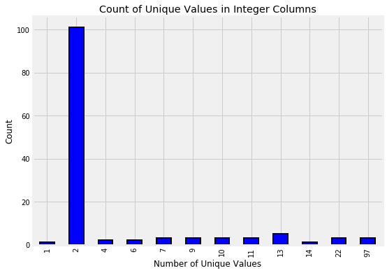
The columns with only 2 unique values represent Booleans (0 or 1). In a lot of cases, this boolean information is already on a household level. For example, the refrig column says whether or not the household has a refrigerator. When it comes time to make features from the Boolean columns that are on the household level, we will not need to aggregate these. However, the Boolean columns that are on the individual level will need to be aggregated.
3.2 Float Columns
Another column type is floats which represent continuous variables. We can make a quick distribution plot to show the distribution of all float columns. We’ll use an OrderedDict to map the poverty levels to colors because this keeps the keys and values in the same order as we specify (unlike a regular Python dictionary).
The following graphs shows the distributions of the float columns colored by the value of the Target. With these plots, we can see if there is a significant difference in the variable distribution depending on the household poverty level.
from collections import OrderedDict

plt.figure(figsize = (20, 16))
plt.style.use('fivethirtyeight')

# Color mapping
colors = OrderedDict({1: 'red', 2: 'orange', 3: 'blue', 4: 'green'})
poverty_mapping = OrderedDict({1: 'extreme', 2: 'moderate', 3: 'vulnerable', 4: 'non vulnerable'})

# Iterate through the float columns
for i, col in enumerate(train.select_dtypes('float')):
    ax = plt.subplot(4, 2, i + 1)
    # Iterate through the poverty levels
    for poverty_level, color in colors.items():
        # Plot each poverty level as a separate line
        sns.kdeplot(train.loc[train['Target'] == poverty_level, col].dropna(),
                    ax = ax, color = color, label = poverty_mapping[poverty_level])

    plt.title(f'{col.capitalize()} Distribution'); plt.xlabel(f'{col}'); plt.ylabel('Density')

plt.subplots_adjust(top = 2)
C:\Anaconda\lib\site-packages\scipy\stats\stats.py:1713: FutureWarning: Using a non-tuple sequence for multidimensional indexing is deprecated; use `arr[tuple(seq)]` instead of `arr[seq]`. In the future this will be interpreted as an array index, `arr[np.array(seq)]`, which will result either in an error or a different result.
  return np.add.reduce(sorted[indexer] * weights, axis=axis) / sumval
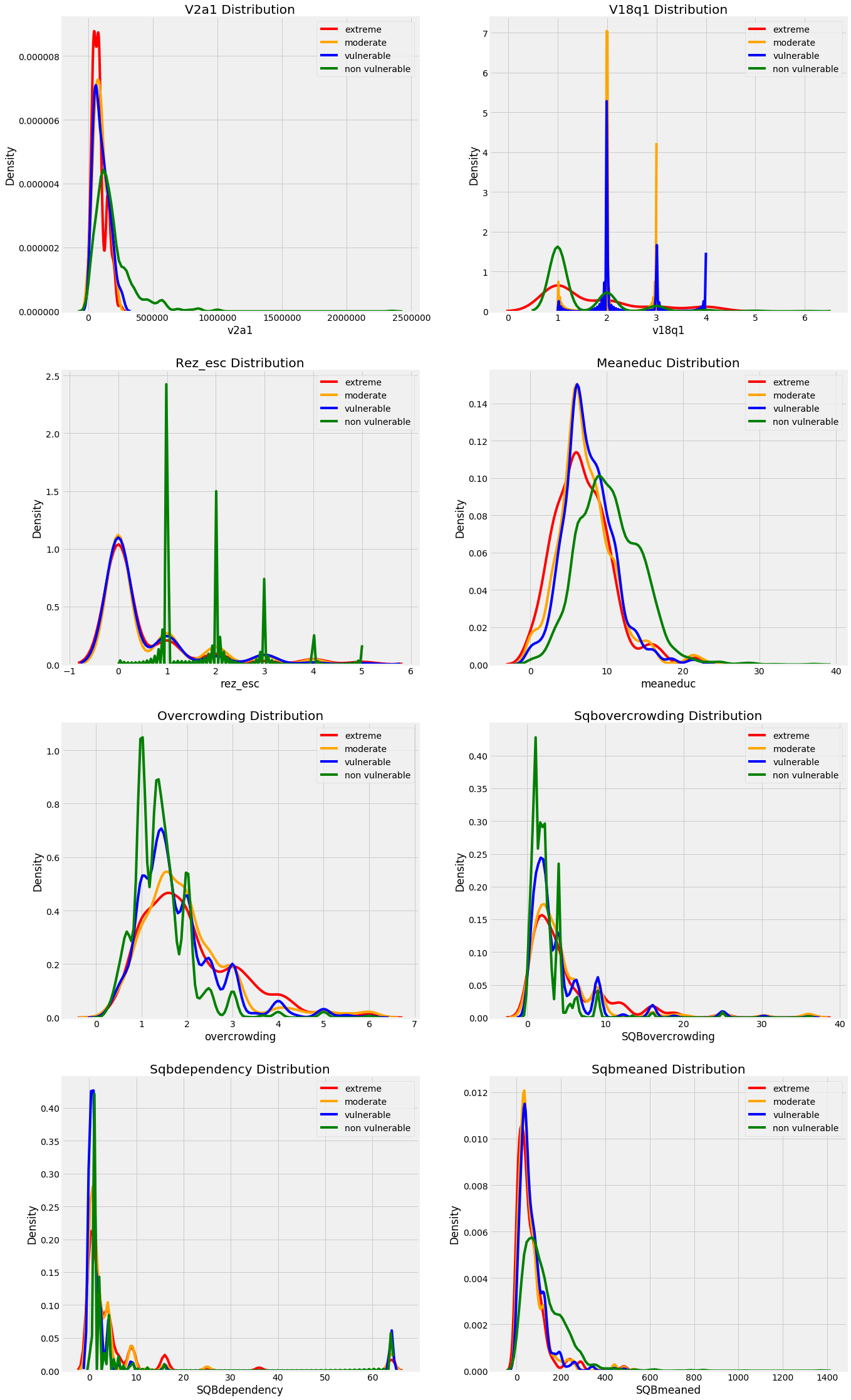
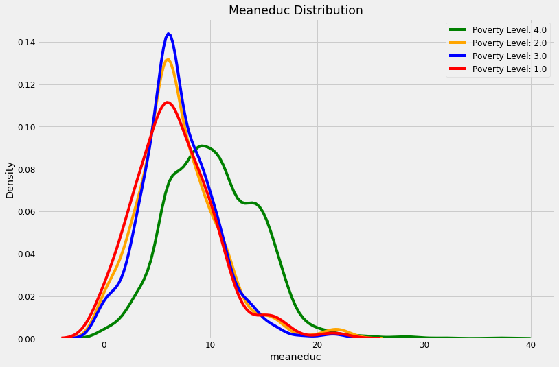
These plots give us a sense of which variables may be most “relevant” to a model. For example, the meaneduc, representing the average education of the adults in the household appears to be related to the poverty level: a higher average adult education leads to higher values of the target which are less severe levels of poverty. The theme of the importance of education is one we will come back to again and again in this notebook!
- We can see that non vulnarable have more numbers of years of education.
- We can see that there are less number of people living in one room in the non vulnarable catogery and it increases as the poverty increases.
Object Columns
train.select_dtypes('object').head()
| Id | idhogar | dependency | edjefe | edjefa | |
|---|---|---|---|---|---|
| 0 | ID_279628684 | 21eb7fcc1 | no | 10 | no |
| 1 | ID_f29eb3ddd | 0e5d7a658 | 8 | 12 | no |
| 2 | ID_68de51c94 | 2c7317ea8 | 8 | no | 11 |
| 3 | ID_d671db89c | 2b58d945f | yes | 11 | no |
| 4 | ID_d56d6f5f5 | 2b58d945f | yes | 11 | no |
The Id and idhogar object types make sense because these are identifying variables. However, the other columns seem to be a mix of strings and numbers which we’ll need to address before doing any machine learning. According to the documentation for these columns:
- dependency: Dependency rate, calculated = (number of members of the household younger than 19 or older than 64)/(number of member of household between 19 and 64)
- edjefe: years of education of male head of household, based on the interaction of escolari (years of education), head of household and gender, yes=1 and no=0
- edjefa: years of education of female head of household, based on the interaction of escolari (years of education), head of household and gender, yes=1 and no=0 These explanations clear up the issue. For these three variables, “yes” = 1 and “no” = 0. We can correct the variables using a mapping and convert to floats.
mapping = {"yes": 1, "no": 0}

# Apply same operation to both train and test
for df in [train, test]:
    # Fill in the values with the correct mapping
    df['dependency'] = df['dependency'].replace(mapping).astype(np.float64)
    df['edjefa'] = df['edjefa'].replace(mapping).astype(np.float64)
    df['edjefe'] = df['edjefe'].replace(mapping).astype(np.float64)

train[['dependency', 'edjefa', 'edjefe']].describe()
| dependency | edjefa | edjefe | |
|---|---|---|---|
| count | 9557.000000 | 9557.000000 | 9557.000000 |
| mean | 1.149550 | 2.896830 | 5.096788 |
| std | 1.605993 | 4.612056 | 5.246513 |
| min | 0.000000 | 0.000000 | 0.000000 |
| 25% | 0.333333 | 0.000000 | 0.000000 |
| 50% | 0.666667 | 0.000000 | 6.000000 |
| 75% | 1.333333 | 6.000000 | 9.000000 |
| max | 8.000000 | 21.000000 | 21.000000 |
plt.figure(figsize = (16, 12))

# Iterate through the float columns
for i, col in enumerate(['dependency', 'edjefa', 'edjefe']):
    ax = plt.subplot(3, 1, i + 1)
    # Iterate through the poverty levels
    for poverty_level, color in colors.items():
        # Plot each poverty level as a separate line
        sns.kdeplot(train.loc[train['Target'] == poverty_level, col].dropna(),
                    ax = ax, color = color, label = poverty_mapping[poverty_level])

    plt.title(f'{col.capitalize()} Distribution'); plt.xlabel(f'{col}'); plt.ylabel('Density')

plt.subplots_adjust(top = 2)
C:\Anaconda\lib\site-packages\scipy\stats\stats.py:1713: FutureWarning: Using a non-tuple sequence for multidimensional indexing is deprecated; use `arr[tuple(seq)]` instead of `arr[seq]`. In the future this will be interpreted as an array index, `arr[np.array(seq)]`, which will result either in an error or a different result.
  return np.add.reduce(sorted[indexer] * weights, axis=axis) / sumval

From the plots we can see that
- Years of education of male and female head of household is very low in extreme poverty and high in non-vulnerable.
- Dependency is very low in non vulnareable.
Join Train and Test Set
We’ll join together the training and testing dataframes. This is important once we start feature engineering because we want to apply the same operations to both dataframes so we end up with the same features. Later we can separate out the sets based on the Target.
# Add null Target column to test
test['Target'] = np.nan
train_len = len(train)
data =  pd.concat(objs=[train, test], axis=0).reset_index(drop=True)
Exploring Label Distribution
Next, we can get an idea of how imbalanced the problem is by looking at the distribution of labels. There are four possible integer levels, indicating four different levels of poverty. To look at the correct labels, we’ll subset only to the columns where parentesco1 == 1 because this is the head of household, the correct label for each household.
The bar plot below shows the distribution of training labels (since there are no testing labels).
# Heads of household
heads = data.loc[data['parentesco1'] == 1].copy()

# Labels for training
train_labels = data.loc[(data['Target'].notnull()) & (data['parentesco1'] == 1), ['Target', 'idhogar']]

# Value counts of target
label_counts = train_labels['Target'].value_counts().sort_index()

# Bar plot of occurrences of each label
label_counts.plot.bar(figsize = (8, 6),
                      color = colors.values(),
                      edgecolor = 'k', linewidth = 2)

# labels and titles
plt.xlabel('Poverty Level'); plt.ylabel('Count');
plt.xticks([x - 1 for x in poverty_mapping.keys()],
           list(poverty_mapping.values()), rotation = 360)
plt.title('Poverty Level Breakdown');

label_counts
1.0     222
2.0     442
3.0     355
4.0    1954
Name: Target, dtype: int64
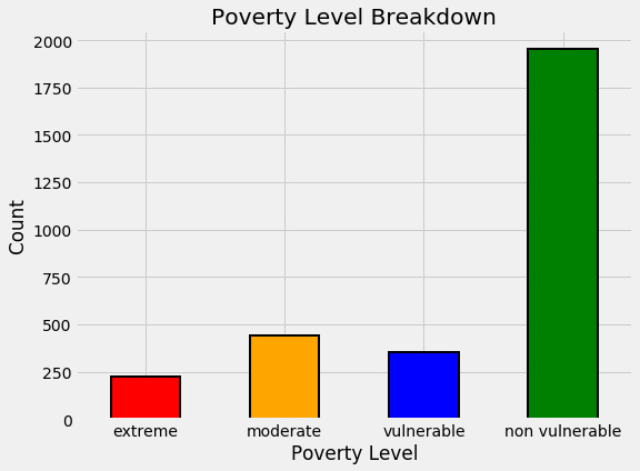
By this plot you and I can see that we are dealing with an imbalanced class problem. There are many more households that classify as non vulnerable than in any other category. The extreme poverty class is the smallest.
One of the major problem with imbalanced classification problems is that the machine learning model will have a difficult time predicting the minority classes because it will get far less examples.
Wrong Labels
For this problem, some of the labels are not correct because individuals in the same household have a different poverty level. We are told to use the head of household as the true label that information makes our job much easier. We will fix the issue with the labels.
Identify Errors
To find the households with different labels for family members, we can group the data by the household and then check if there is only one unique value of the Target.
# Groupby the household and figure out the number of unique values
all_equal = train.groupby('idhogar')['Target'].apply(lambda x: x.nunique() == 1)

# Households where targets are not all equal
not_equal = all_equal[all_equal != True]
print('There are {} households where the family members do not all have the same target.'.format(len(not_equal)))
There are 85 households where the family members do not all have the same target.
# Example
train[train['idhogar'] == not_equal.index[0]][['idhogar', 'parentesco1', 'Target']]
| idhogar | parentesco1 | Target | |
|---|---|---|---|
| 7651 | 0172ab1d9 | 0 | 3 |
| 7652 | 0172ab1d9 | 0 | 2 |
| 7653 | 0172ab1d9 | 0 | 3 |
| 7654 | 0172ab1d9 | 1 | 3 |
| 7655 | 0172ab1d9 | 0 | 2 |
The correct label for the head of household is where parentesco1 == 1. For this household, the correct label is 3 for all members. We will correct this by reassigning all the individuals in this household the correct poverty level.
Families without Heads of Household
We will correct all the label discrepancies by assigning the individuals in the same household the label of the head of household. Let’s check if there are households without a head of household and if the members of those households have differing values of the label.
households_leader = train.groupby('idhogar')['parentesco1'].sum()

# Find households without a head
households_no_head = train.loc[train['idhogar'].isin(households_leader[households_leader == 0].index), :]

print('There are {} households without a head.'.format(households_no_head['idhogar'].nunique()))
There are 15 households without a head.
# Find households without a head and where labels are different
households_no_head_equal = households_no_head.groupby('idhogar')['Target'].apply(lambda x: x.nunique() == 1)
print('{} Households with no head have different labels.'.format(sum(households_no_head_equal == False)))
0 Households with no head have different labels.
Labels
Let’s correct the labels for the households that have a Head and the members have different poverty levels.
# Iterate through each household
for household in not_equal.index:
    # Find correct label for head of household
    true_target = int(train[(train['idhogar'] == household) & (train['parentesco1'] == 1.0)]['Target'])

    # Set correct label for all members in the household
    train.loc[train['idhogar'] == household, 'Target'] = true_target


# Groupby the household and figure out the number of unique values
all_equal = train.groupby('idhogar')['Target'].apply(lambda x: x.nunique() == 1)

# Households where targets are not all equal
not_equal = all_equal[all_equal != True]
print('There are {} households where the family members do not have the same target.'.format(len(not_equal)))
There are 0 households where the family members do not have the same target.
Missing Data
First we can look at the percentage of missing values in each column.
# Number of missing in each column
missing = pd.DataFrame(data.isnull().sum()).rename(columns = {0: 'total'})

# Percentage missing
missing['percent'] = missing['total'] / len(data)

missing.sort_values('percent', ascending = False).head(10).drop('Target')
| total | percent | |
|---|---|---|
| rez_esc | 27581 | 0.825457 |
| v18q1 | 25468 | 0.762218 |
| v2a1 | 24263 | 0.726154 |
| SQBmeaned | 36 | 0.001077 |
| meaneduc | 36 | 0.001077 |
| hogar_adul | 0 | 0.000000 |
| parentesco10 | 0 | 0.000000 |
| parentesco11 | 0 | 0.000000 |
| parentesco12 | 0 | 0.000000 |
In Target we put NaN in the test data. So, there are 3 columns with a high percentage of missing values.
v18q1: Number of tablets
Let’s start with v18q1 which indicates the number of tablets owned by a family. We can look at the value counts of this variable. Since this is a household variable, it only makes sense to look at it on a household level, so we’ll only select the rows for the head of household.
Function to Plot Value Counts
Since we might want to plot value counts for different columns, we can write a simple function that will do it for us!
def plot_value_counts(df, col, heads_only = False): “"”Plot value counts of a column, optionally with only the heads of a household””” # Select heads of household if heads_only: df = df.loc[df[‘parentesco1’] == 1].copy()
plt.figure(figsize = (8, 6))
df[col].value_counts().sort_index().plot.bar(color = 'blue',
                                             edgecolor = 'k',
                                             linewidth = 2)
plt.xlabel(f'{col}'); plt.title(f'{col} Value Counts'); plt.ylabel('Count')
plt.show();
# Import function to plot value counts of column
from costarican.data_plot import plot_value_counts
# Plot the data
plot_value_counts(heads, 'v18q1')
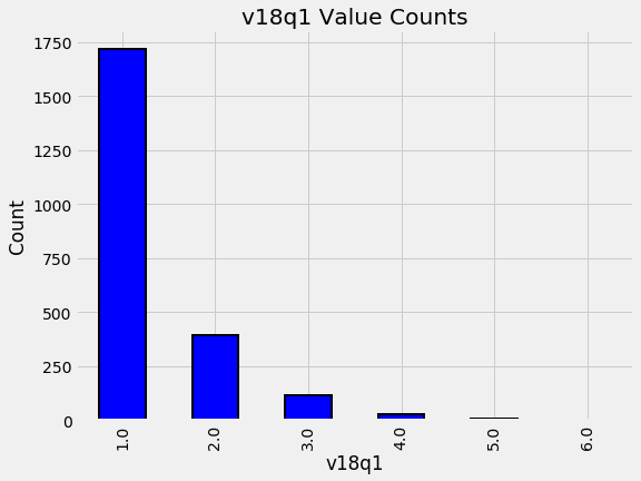
By looking into the data we can see that the most common number of tablets to own is 1. However, We also need to think about the data that is missing. In this case, it could be that families with a NaN in this category just do not own a tablet! If we look at the data definitions, we can see that v18q indicates whether or not a family owns a tablet. We will investigate this column combined with the number of tablets to see if the hypothesis holds true.
We can groupby the value of v18q (which is 1 for owns a tablet and 0 for does not) and then calculate the number of null values for v18q1. This will tell us if the null values represent that the family does not own a tablet.
heads.groupby('v18q')['v18q1'].apply(lambda x: x.isnull().sum())
v18q
0    8044
1       0
Name: v18q1, dtype: int64
So, Every family that has NaN for v18q1 does not own a tablet. So, we will fill in this missing value with zero.
data['v18q1'] = data['v18q1'].fillna(0)
v2a1: Monthly rent payment
The next missing column is v2a1 which represents the montly rent payment.
In addition to looking at the missing values of the monthly rent payment, it will be interesting to also look at the distribution of tipovivi_, the columns showing the ownership/renting status of the home. For this plot, we will show the ownership status of those homes with a NaN for the monthyl rent payment.
# Variables indicating home ownership
own_variables = [x for x in data if x.startswith('tipo')]

# Plot of the home ownership variables for home missing rent payments
data.loc[data['v2a1'].isnull(), own_variables].sum().plot.bar(figsize = (10, 8),
                                                                        color = 'green',
                                                              edgecolor = 'k', linewidth = 2);
plt.xticks([0, 1, 2, 3, 4],
           ['Owns and Paid Off', 'Owns and Paying', 'Rented', 'Precarious', 'Other'],
          rotation = 20)
plt.title('Home Ownership Status for Households Missing Rent Payments', size = 18);
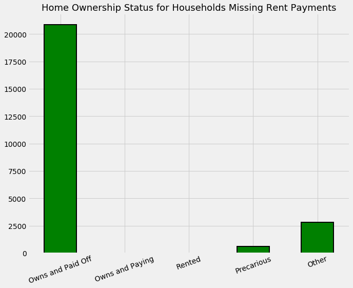
The meaning of the home ownership variables:
- tipovivi1, =1 own and fully paid house
- tipovivi2, “=1 own, paying in installments”
- tipovivi3, =1 rented
- tipovivi4, =1 precarious
- tipovivi5, “=1 other(assigned, borrowed)”
Mostly the households that do not have a monthly rent payment generally own their own home. In some other situations, we are not sure of the reason for the missing information.
For the houses that are owned and have a missing monthly rent payment, we will set the value of the rent payment to zero and for the other homes, we will leave the missing values to be imputed but we’ll add a flag (Boolean) column indicating that these households had missing values.
# Fill in households that own the house with 0 rent payment
data.loc[(data['tipovivi1'] == 1), 'v2a1'] = 0

# Create missing rent payment column
data['v2a1-missing'] = data['v2a1'].isnull()

data['v2a1-missing'].value_counts()
False    29994
True      3419
Name: v2a1-missing, dtype: int64
rez_esc: years behind in school
The last column with a high percentage of missing values is rez_esc indicating years behind in school. For the families with a null value, it is possible that they have no children currently in school. Let’s test this out by finding the ages of those who have a missing value in this column and the ages of those who do not have a missing value.
data.loc[data['rez_esc'].notnull()]['age'].describe()
count    5832.000000
mean       12.185700
std         3.198618
min         7.000000
25%         9.000000
50%        12.000000
75%        15.000000
max        17.000000
Name: age, dtype: float64
Now we can see that the oldest age with a missing value is 17. For anyone older than this, maybe we can assume that they are simply not in school. Let’s look at the ages of those who have a missing value.
data.loc[data['rez_esc'].isnull()]['age'].describe()
count    27581.000000
mean        39.110656
std         20.983114
min          0.000000
25%         24.000000
50%         38.000000
75%         54.000000
max         97.000000
Name: age, dtype: float64
Anyone younger or older than 7-19 presumably has no years behind and therefore the value should be set to 0. For this variable, if the individual is over 19 and they have a missing value, or if they are younger than 7 and have a missing value we can set it to zero. For anyone else, we’ll leave the value to be imputed and add a boolean flag.
# If individual is over 19 or younger than 7 and missing years behind, set it to 0
data.loc[((data['age'] > 19) | (data['age'] < 7)) & (data['rez_esc'].isnull()), 'rez_esc'] = 0

# Add a flag for those between 7 and 19 with a missing value
data['rez_esc-missing'] = data['rez_esc'].isnull()
There is also one outlier in the rez_esc column. In the competition discussions, I learned that the maximum value for this variable is 5. Therefore, any values above 5 should be set to 5.
data.loc[data['rez_esc'] > 5, 'rez_esc'] = 5
Plot Two Categorical Variables
# Import function to plot
from costarican.cat_plot import categorical_plot
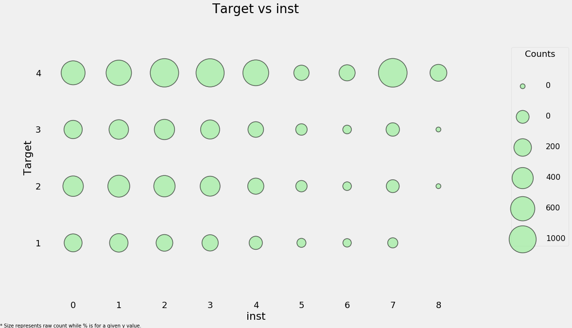
categorical_plot('rez_esc', 'Target', data);
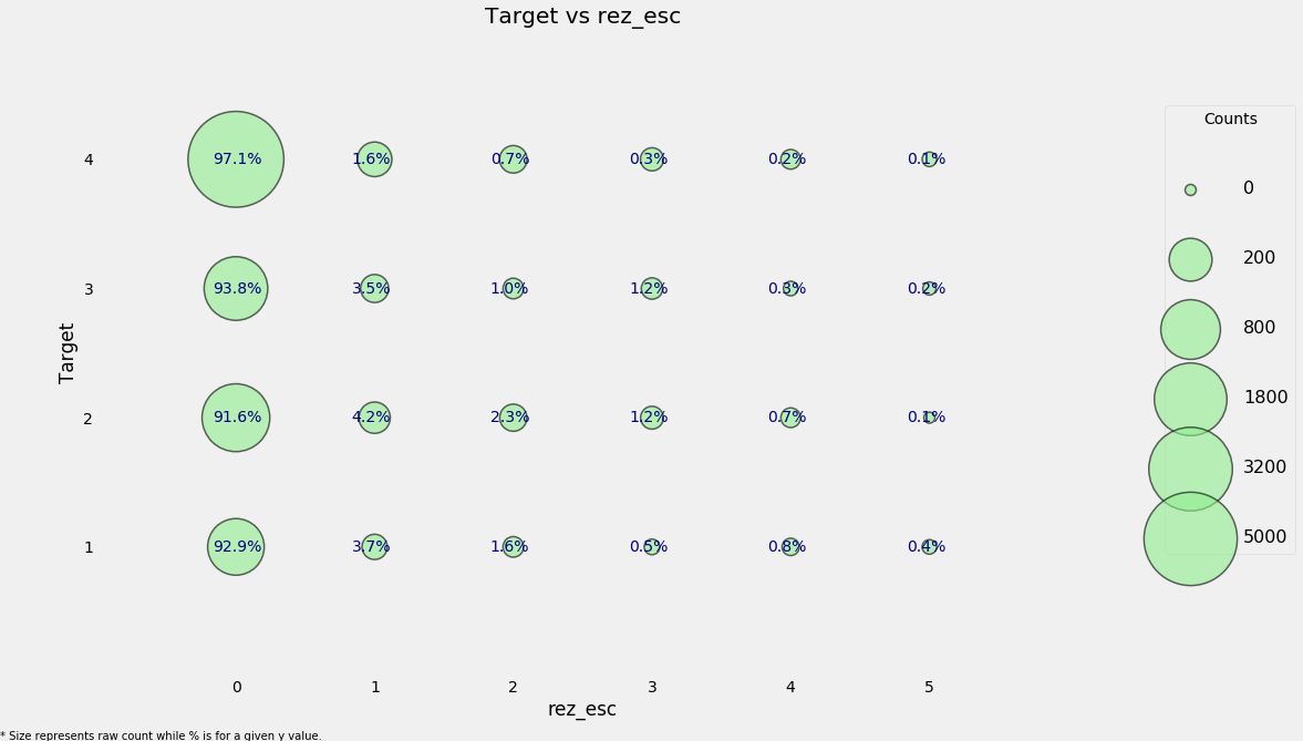
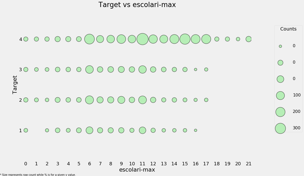
The size of the markers represents the raw count. To read the plot, choose a given y-value and then read across the row. For example, with a poverty level of 1, 93% of individuals have no years behind with a total count of around 800 individuals and about 0.4% of individuals are 5 years behind with about 50 total individuals in this category. This plot attempts to show both the overall counts and the within category proportion.
# Poverty vs years of schooling
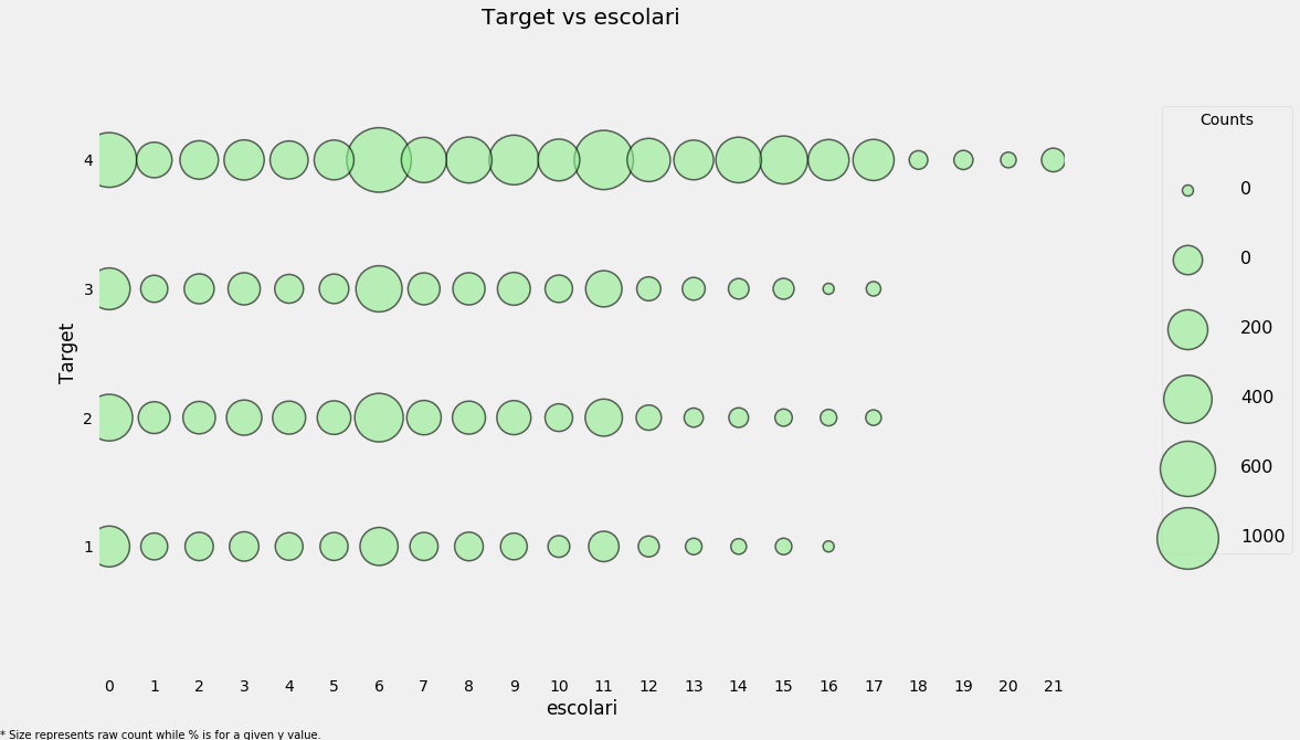
categorical_plot('escolari', 'Target', data, annotate = False)
We will fill in the remaining missing values in each column. As a final step with the missing values, we can plot the distribution of target for the case where either of these values are missing.
plot_value_counts(data[(data['rez_esc-missing'] == 1)],
                  'Target')
The distribution here seems to match that for all the data at large.
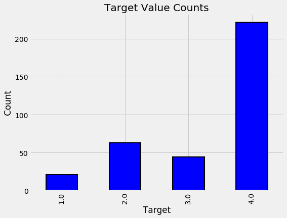
plot_value_counts(data[(data['v2a1-missing'] == 1)],
                  'Target')
This looks like it could be an indicator of more poverty given the higher prevalence of 2: moderate poverty.
Feature Engineering
Column Definitions
We will define different variables because we need to treat some of them in a different manner. Once we have the variables defined on each level, we can work to start aggregating them as needed.
The process is as follows
- Break variables into household level and invididual level
- Find suitable aggregations for the individual level data
- Ordinal variables can use statistical aggregations
- Boolean variables can also be aggregated but with fewer stats
- Join the individual aggregations to the household level data
Define Variable Categories
There are several different categories of variables:
- Individual Variables: these are characteristics of each individual rather than the household
- Boolean: Yes or No (0 or 1)
- Ordered Discrete: Integers with an ordering
- Household variables
- Boolean: Yes or No
- Ordered Discrete: Integers with an ordering
- Continuous numeric
- Squared Variables: derived from squaring variables in the data
- Id variables: identifies the data and should not be used as features
First we manually define the variables in each category.
#These will be kept as is in the data since we need them for identification.
id_ = ['Id', 'idhogar', 'Target']
# Individual boolean
ind_bool = ['v18q', 'dis', 'male', 'female', 'estadocivil1', 'estadocivil2', 'estadocivil3',
            'estadocivil4', 'estadocivil5', 'estadocivil6', 'estadocivil7',
            'parentesco1', 'parentesco2',  'parentesco3', 'parentesco4', 'parentesco5',
            'parentesco6', 'parentesco7', 'parentesco8',  'parentesco9', 'parentesco10',
            'parentesco11', 'parentesco12', 'instlevel1', 'instlevel2', 'instlevel3',
            'instlevel4', 'instlevel5', 'instlevel6', 'instlevel7', 'instlevel8',
            'instlevel9', 'mobilephone', 'rez_esc-missing']

# Individual Numbers
ind_ordered = ['rez_esc', 'escolari', 'age']
# Household boolean
hh_bool = ['hacdor', 'hacapo', 'v14a', 'refrig', 'paredblolad', 'paredzocalo',
           'paredpreb','pisocemento', 'pareddes', 'paredmad',
           'paredzinc', 'paredfibras', 'paredother', 'pisomoscer', 'pisoother',
           'pisonatur', 'pisonotiene', 'pisomadera',
           'techozinc', 'techoentrepiso', 'techocane', 'techootro', 'cielorazo',
           'abastaguadentro', 'abastaguafuera', 'abastaguano',
            'public', 'planpri', 'noelec', 'coopele', 'sanitario1',
           'sanitario2', 'sanitario3', 'sanitario5',   'sanitario6',
           'energcocinar1', 'energcocinar2', 'energcocinar3', 'energcocinar4',
           'elimbasu1', 'elimbasu2', 'elimbasu3', 'elimbasu4',
           'elimbasu5', 'elimbasu6', 'epared1', 'epared2', 'epared3',
           'etecho1', 'etecho2', 'etecho3', 'eviv1', 'eviv2', 'eviv3',
           'tipovivi1', 'tipovivi2', 'tipovivi3', 'tipovivi4', 'tipovivi5',
           'computer', 'television', 'lugar1', 'lugar2', 'lugar3',
           'lugar4', 'lugar5', 'lugar6', 'area1', 'area2', 'v2a1-missing']

# Household numbers
hh_ordered = [ 'rooms', 'r4h1', 'r4h2', 'r4h3', 'r4m1','r4m2','r4m3', 'r4t1',  'r4t2',
              'r4t3', 'v18q1', 'tamhog','tamviv','hhsize','hogar_nin',
              'hogar_adul','hogar_mayor','hogar_total',  'bedrooms', 'qmobilephone']

# Household continuous numbers
hh_cont = ['v2a1', 'dependency', 'edjefe', 'edjefa', 'meaneduc', 'overcrowding']
# Squared Variables
sqr_ = ['SQBescolari', 'SQBage', 'SQBhogar_total', 'SQBedjefe',
        'SQBhogar_nin', 'SQBovercrowding', 'SQBdependency', 'SQBmeaned', 'agesq']
# To check no repitition
x = ind_bool + ind_ordered + id_ + hh_bool + hh_ordered + hh_cont + sqr_

from collections import Counter

print('No repeats: ', np.all(np.array(list(Counter(x).values())) == 1))
print('Covered every variable: ', len(x) == data.shape[1])
No repeats:  True
Covered every variable:  True
Squared Variables
Let’s remove all of the squared variables to help linear models learn relationships that are non-linear. However, since we will be using more complex models, these squared features are redundant and are highly correlated with the non-squared version, and hence will hurt our model by adding irrelevant information and also slowing down training.
sns.lmplot('age', 'SQBage', data = data, fit_reg=False);
plt.title('Squared Age versus Age');
Highly correlated, and we don’t need to keep both in our data. Therefore let’s remove it.
# Remove squared variables
data = data.drop(columns = sqr_)
data.shape
(33413, 136)
Household Level Variables
First let’s subset to the heads of household and then to the household level variables.
heads = data.loc[data['parentesco1'] == 1, :]
heads = heads[id_ + hh_bool + hh_cont + hh_ordered]
heads.shape
(10307, 99)
For most of the household level variables, we can simply keep them as it is. Since we want to make predictions for each household, we will use these variables as features. However, we can also remove some redundant variables and also add in some more features derived from existing data.
Redundant Household Variables
Let’s take a look at the correlations between all of the household variables. If there are any that are too highly correlated, then we might want to remove one of the pair of highly correlated variables.
## The following code identifies any variables with a greater than 0.95 absolute magnitude correlation.
## Code to find highly corelated variables
# Create correlation matrix
corr_matrix = heads.corr()

# Select upper triangle of correlation matrix
upper = corr_matrix.where(np.triu(np.ones(corr_matrix.shape), k=1).astype(np.bool))

# Find index of feature columns with correlation greater than 0.95
to_drop = [column for column in upper.columns if any(abs(upper[column]) > 0.95)]

to_drop
['coopele', 'area2', 'tamhog', 'hhsize', 'hogar_total']
These show one out of each pair of correlated variables. To find the other pair, we can subset the corr_matrix.
corr_matrix.loc[corr_matrix['tamhog'].abs() > 0.9, corr_matrix['tamhog'].abs() > 0.9]
| r4t3 | tamhog | tamviv | hhsize | hogar_total | |
|---|---|---|---|---|---|
| r4t3 | 1.000000 | 0.998287 | 0.910457 | 0.998287 | 0.998287 |
| tamhog | 0.998287 | 1.000000 | 0.909155 | 1.000000 | 1.000000 |
| tamviv | 0.910457 | 0.909155 | 1.000000 | 0.909155 | 0.909155 |
| hhsize | 0.998287 | 1.000000 | 0.909155 | 1.000000 | 1.000000 |
| hogar_total | 0.998287 | 1.000000 | 0.909155 | 1.000000 | 1.000000 |
# Heatmap to see the corelation
sns.heatmap(corr_matrix.loc[corr_matrix['tamhog'].abs() > 0.9, corr_matrix['tamhog'].abs() > 0.9],
            annot=True, cmap = plt.cm.autumn_r, fmt='.3f');
There are several variables here having to do with the size of the house:
- r4t3, Total persons in the household
- tamhog, size of the household
- tamviv, number of persons living in the household
- hhsize, household size
- hogar_total, # of total individuals in the household
These variables are all highly correlated with one another. hhsize has a perfect correlation with tamhog and hogar_total. So, we will remove these two variables because the information is redundant. We can also remove r4t3 because it has a near perfect correlation with hhsize. We wil drop tamhog, hogar_total, r4t3
tamviv is not necessarily the same as hhsize because there might be family members that are not living in the household. Let’s visualize this difference in a scatterplot.
heads = heads.drop(columns = ['tamhog', 'hogar_total', 'r4t3'])
# Scatter plot of house size and number of people living in the household
sns.lmplot('tamviv', 'hhsize', data, fit_reg=False, size = 8);
plt.title('Household size vs number of persons living in the household');
C:\Anaconda\lib\site-packages\seaborn\regression.py:546: UserWarning: The `size` paramter has been renamed to `height`; please update your code.
  warnings.warn(msg, UserWarning)
We see for a number of cases, there are more people living in the household than there are in the family.
This gives us a good idea for a new feature: the difference between these two measurements!
# Difference between household size and number of people living in that house
heads['hhsize-diff'] = heads['tamviv'] - heads['hhsize']
categorical_plot('hhsize-diff', 'Target', heads)
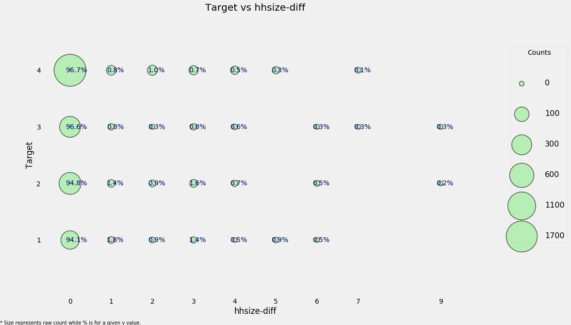
Even though most households do not have a difference, there are a few that have more people living in the household than are members of the household. Let’s move on to the other redundant variables.
# Let;s look at coopele(electricity from cooperative)
corr_matrix.loc[corr_matrix['coopele'].abs() > 0.9, corr_matrix['coopele'].abs() > 0.9]
| public | coopele | |
|---|---|---|
| public | 1.000000 | -0.967759 |
| coopele | -0.967759 | 1.000000 |
These variables indicate where the electricity in the home is coming from. There are four options, and the families that don’t have one of these two options either have no electricity (noelec) or get it from a private plant (planpri).
Creating Ordinal Variable
We will compress these four variables into one by creating an ordinal variable.
The mapping based on the data decriptions:
- 0: No electricity
- 1: Electricity from cooperative
- 2: Electricity from CNFL, ICA, ESPH/JASEC
- 3: Electricity from private plant
elec = []

# Assign values
for i, row in heads.iterrows():
    if row['noelec'] == 1:
        elec.append(0)
    elif row['coopele'] == 1:
        elec.append(1)
    elif row['public'] == 1:
        elec.append(2)
    elif row['planpri'] == 1:
        elec.append(3)
    else:
        elec.append(np.nan)

# Record the new variable and missing flag
heads['elec'] = elec
heads['elec-missing'] = heads['elec'].isnull()
categorical_plot('elec', 'Target', heads)
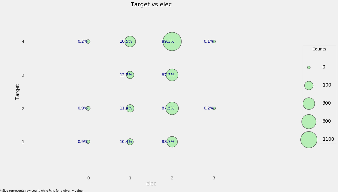
We can see that for every value of the Target, the most common source of electricity is from one of the listed providers.
The final redundant column is area2 which means that the house is in a rural zone, but it’s redundant because we have a column indicating if the house is in a urban zone. Therefore, we can drop this column.
heads = heads.drop(columns = 'area2')

heads.groupby('area1')['Target'].value_counts(normalize = True)
area1  Target
0      4.0       0.582249
       2.0       0.176331
       3.0       0.147929
       1.0       0.093491
1      4.0       0.687030
       2.0       0.137688
       3.0       0.108083
       1.0       0.067199
Name: Target, dtype: float64
It seems like households in an urban area (value of 1) are more likely to have lower poverty levels than households in a rural area (value of 0).
Creating Ordinal Variables
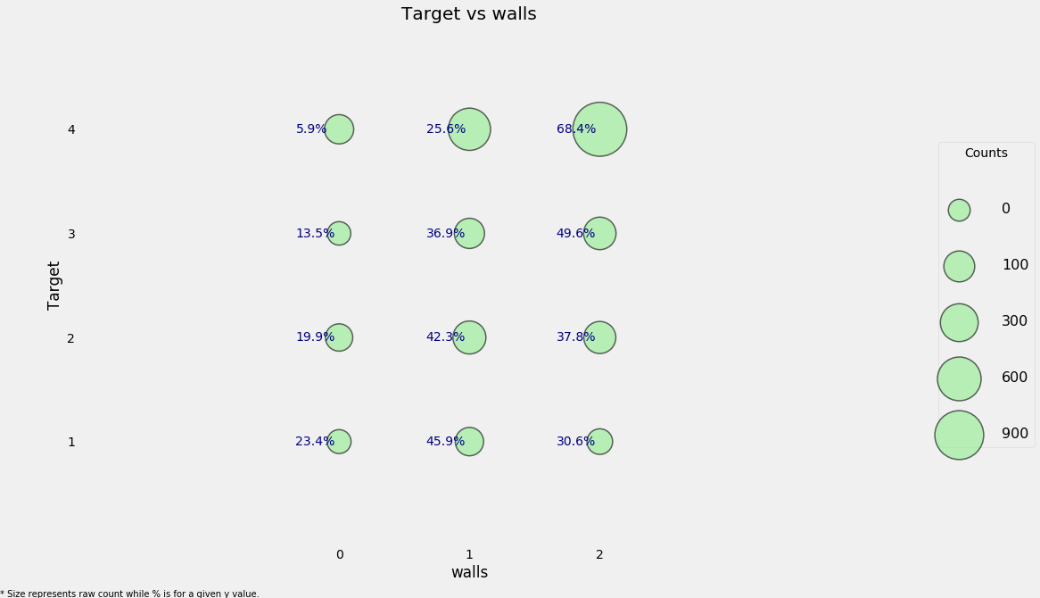
So for the walls, roof, and floor of the house, there are three columns each:
- First indicating ‘bad’
- Second ‘regular’
- Third ‘good’.
We could leave the variables as booleans, but to me it makes more sense to turn them into ordinal variables because there is an inherent order: bad < regular < good.
To do this, we can simply find whichever column is non-zero for each household using
np.argmaxand once we have created the ordinal variable, we are able to drop the original variables.
# Wall ordinal variable
heads['walls'] = np.argmax(np.array(heads[['epared1', 'epared2', 'epared3']]),
                           axis = 1)

# heads = heads.drop(columns = ['epared1', 'epared2', 'epared3'])
categorical_plot('walls', 'Target', heads)
# Roof ordinal variable
heads['roof'] = np.argmax(np.array(heads[['etecho1', 'etecho2', 'etecho3']]),
                           axis = 1)
heads = heads.drop(columns = ['etecho1', 'etecho2', 'etecho3'])

# Floor ordinal variable
heads['floor'] = np.argmax(np.array(heads[['eviv1', 'eviv2', 'eviv3']]),
                           axis = 1)
Feature Construction
We will create a new feature which will add up the previous three features we just created to get an overall measure of the quality of the house’s structure.
# Create new feature (overall quality of the house)
heads['walls+roof+floor'] = heads['walls'] + heads['roof'] + heads['floor']

categorical_plot('walls+roof+floor', 'Target', heads, annotate=False)
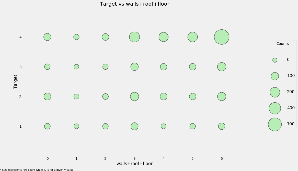
This new feature may be useful because it seems like a Target of 4 (the lowest poverty level) tends to have higher values of the ‘house quality’ variable. We can also look at this in a table to get the fine-grained details.
counts = pd.DataFrame(heads.groupby(['walls+roof+floor'])['Target'].value_counts(normalize = True)
                     ).rename(columns = {'Target': 'Normalized Count'}).reset_index()
counts.head()
| walls+roof+floor | Target | Normalized Count | |
|---|---|---|---|
| 0 | 0 | 4.0 | 0.376404 |
| 1 | 0 | 2.0 | 0.320225 |
| 2 | 0 | 1.0 | 0.162921 |
| 3 | 0 | 3.0 | 0.140449 |
| 4 | 1 | 4.0 | 0.323529 |
The next variable will be a warning about the quality of the house. It will be a negative value, with -1 point each for no toilet, electricity, floor, water service, and ceiling.
# No toilet, no electricity, no floor, no water service, no ceiling
heads['warning'] = 1 * (heads['sanitario1'] +
                         (heads['elec'] == 0) +
                         heads['pisonotiene'] +
                         heads['abastaguano'] +
                         (heads['cielorazo'] == 0))
categorical_plot('warning', 'Target', data = heads)
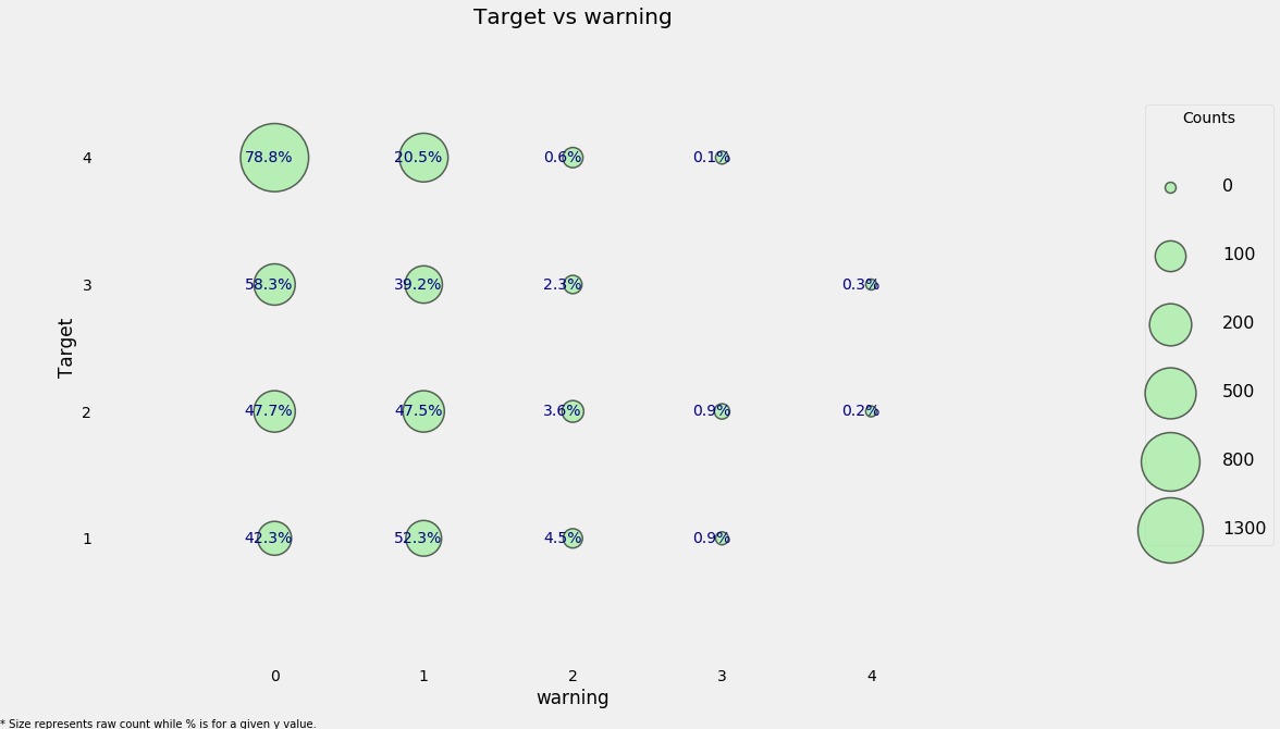
Here we can see a high concentration of households that have no warning signs and have the lowest level of poverty and it looks as if this may be a useful feature.
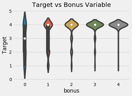
The final household feature we can make for now is where a family gets a point for having a refrigerator, computer, tablet, or television.
# Owns a refrigerator, computer, tablet, and television
heads['bonus'] = 1 * (heads['refrig'] +
                      heads['computer'] +
                      (heads['v18q1'] > 0) +
                      heads['television'])

sns.violinplot('bonus', 'Target', data = heads,
                figsize = (10, 6));
plt.title('Target vs Bonus Variable');
C:\Anaconda\lib\site-packages\scipy\stats\stats.py:1713: FutureWarning: Using a non-tuple sequence for multidimensional indexing is deprecated; use `arr[tuple(seq)]` instead of `arr[seq]`. In the future this will be interpreted as an array index, `arr[np.array(seq)]`, which will result either in an error or a different result.
  return np.add.reduce(sorted[indexer] * weights, axis=axis) / sumval
Per Capita Features
We can calculate the number of certain measurements for each person in the household:
tamviv-> Number of person living in the household
heads['phones-per-capita'] = heads['qmobilephone'] / heads['tamviv']
heads['tablets-per-capita'] = heads['v18q1'] / heads['tamviv']
heads['rooms-per-capita'] = heads['rooms'] / heads['tamviv']
heads['rent-per-capita'] = heads['v2a1'] / heads['tamviv']
Exploring Household Variables
Measuring Relationships
There are many ways for measuring relationships between two variables. Here we will examine two of these:
- The Pearson Correlation: from -1 to 1 measuring the linear relationship between two variables
- The Spearman Correlation: from -1 to 1 measuring the monotonic relationship between two variables
The Spearman correlation is 1 if as one variable increases, the other does as well, even if the relationship is not linear. On the other hand, the Pearson correlation can only be one if the increase is exactly linear. These are best illustrated by example.
# The spearmanr correlation
from scipy.stats import spearmanr
The Spearman correlation is often considered to be better for ordinal variables such as the Target or the years of education. Most relationshisp in the real world aren’t linear, and although the Pearson correlation can be an approximation of how related two variables are, it’s inexact and not the best method of comparison. So, first we will calculate the Pearson correlation of every variable with the Target.
# Use only training data
train_heads = heads.loc[heads['Target'].notnull(), :].copy()

pcorrs = pd.DataFrame(train_heads.corr()['Target'].sort_values()).rename(columns = {'Target': 'pcorr'}).reset_index()
pcorrs = pcorrs.rename(columns = {'index': 'feature'})

print('Most negatively correlated variables:')
print(pcorrs.head())

print('\nMost positively correlated variables:')
print(pcorrs.dropna().tail())
Most negatively correlated variables:
        feature     pcorr
0       warning -0.301791
1     hogar_nin -0.266309
2          r4t1 -0.260917
3  overcrowding -0.234954
4         eviv1 -0.217908

Most positively correlated variables:
               feature     pcorr
97   phones-per-capita  0.299026
98               floor  0.307605
99    walls+roof+floor  0.332446
100           meaneduc  0.333652
101             Target  1.000000
For the negative correlations, as we increase the variable, the Target decreases indicating the poverty severity increases.
- Therefore, as the warning increases, the poverty level also increases which makes sense because this was meant to show potential bad signs about a house.
- The hogar_nin is the number of children 0 - 19 in the family which also makes sense as younger children can be financial source of stress on a family leading to higher levels of poverty or we can say that the families with lower socioeconomic status have more children in the hopes that one of them will be able to succeed.So there is a real link between family size and poverty
For the positive correlations, a higher value means a higher value of Target indicating the poverty severity decreases.
- The most highly correlated household level variable is meaneduc, the average education level of the adults in the household.This relationship between education and poverty intuitively makes sense as greater levels of education generally correlate with lower levels of poverty.
The general guidelines for correlation values are below, but these will change depending on who you ask (source for these):
- .00-.19 “very weak”
- .20-.39 “weak”
- .40-.59 “moderate”
- .60-.79 “strong”
- .80-1.0 “very strong”
What these correlations show is that there are some weak relationships that hopefully our model will be able to use to learn a mapping from the features to the Target.
Now we can move on to the Spearman correlation.
# Spearman correlation.
feats = []
scorr = []
pvalues = []

# Iterate through each column
for c in heads:
    # Only valid for numbers
    if heads[c].dtype != 'object':
        feats.append(c)

        # Calculate spearman correlation
        scorr.append(spearmanr(train_heads[c], train_heads['Target']).correlation)
        pvalues.append(spearmanr(train_heads[c], train_heads['Target']).pvalue)

scorrs = pd.DataFrame({'feature': feats, 'scorr': scorr, 'pvalue': pvalues}).sort_values('scorr')
The Spearman correlation coefficient calculation also comes with a pvalue indicating the significance level of the relationship. Any pvalue less than 0.05 is genearally regarded as significant, although since we are doing multiple comparisons, we want to divide the p-value by the number of comparisons, a process known as the Bonferroni correction.
print('Most negative Spearman correlations:')
print(scorrs.head())
print('\nMost positive Spearman correlations:')
print(scorrs.dropna().tail())
Most negative Spearman correlations:
       feature     scorr        pvalue
97     warning -0.307326  4.682829e-66
68  dependency -0.281516  2.792620e-55
85   hogar_nin -0.236225  5.567218e-39
80        r4t1 -0.219226  1.112230e-33
49       eviv1 -0.217803  2.952571e-33

Most positive Spearman correlations:
              feature     scorr        pvalue
23          cielorazo  0.300996  2.611808e-63
95              floor  0.309638  4.466091e-67
99  phones-per-capita  0.337377  4.760104e-80
96   walls+roof+floor  0.338791  9.539346e-81
0              Target  1.000000  0.000000e+00
For the most part, the two methods of calculating correlations are in agreement. So let’s look for the values that are furthest apart.
corrs = pcorrs.merge(scorrs, on = 'feature')
corrs['diff'] = corrs['pcorr'] - corrs['scorr']

corrs.sort_values('diff').head()
| feature | pcorr | scorr | pvalue | diff | |
|---|---|---|---|---|---|
| 77 | rooms-per-capita | 0.152185 | 0.223303 | 6.521453e-35 | -0.071119 |
| 85 | v18q1 | 0.197493 | 0.244200 | 1.282664e-41 | -0.046708 |
| 87 | tablets-per-capita | 0.204638 | 0.248642 | 3.951568e-43 | -0.044004 |
| 2 | r4t1 | -0.260917 | -0.219226 | 1.112230e-33 | -0.041691 |
| 97 | phones-per-capita | 0.299026 | 0.337377 | 4.760104e-80 | -0.038351 |
corrs.sort_values('diff').dropna().tail()
| feature | pcorr | scorr | pvalue | diff | |
|---|---|---|---|---|---|
| 57 | techozinc | 0.014357 | 0.003404 | 8.528369e-01 | 0.010954 |
| 49 | hogar_mayor | -0.025173 | -0.041722 | 2.290994e-02 | 0.016549 |
| 88 | edjefe | 0.235687 | 0.214736 | 2.367521e-32 | 0.020951 |
| 66 | edjefa | 0.052310 | 0.005114 | 7.804715e-01 | 0.047197 |
| 17 | dependency | -0.126465 | -0.281516 | 2.792620e-55 | 0.155051 |
The largest discrepancy in the correlations is dependency. We can make a scatterplot of the Target versus the dependency to visualize the relationship. We’ll add a little jitter to the plot because these are both discrete variables.
sns.lmplot('dependency', 'Target', fit_reg = True, data = train_heads, x_jitter=0.05, y_jitter=0.05);
plt.title('Target vs Dependency');
C:\Anaconda\lib\site-packages\scipy\stats\stats.py:1713: FutureWarning: Using a non-tuple sequence for multidimensional indexing is deprecated; use `arr[tuple(seq)]` instead of `arr[seq]`. In the future this will be interpreted as an array index, `arr[np.array(seq)]`, which will result either in an error or a different result.
  return np.add.reduce(sorted[indexer] * weights, axis=axis) / sumval
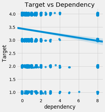
It’s hard to see the relationship, but it’s slightly negative: as the dependency increases, the value of the Target decreases. This actually makes sense as the dependency is the number of dependent individuals divided by the number of non-dependents. As we increase this value, the poverty severty tends to increase: having more dependent family members (who usually are non-working) leads to higher levels of poverty because they must be supported by the non-dependent family members.
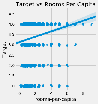
sns.lmplot('rooms-per-capita', 'Target', fit_reg = True, data = train_heads, x_jitter=0.05, y_jitter=0.05);
plt.title('Target vs Rooms Per Capita');
C:\Anaconda\lib\site-packages\scipy\stats\stats.py:1713: FutureWarning: Using a non-tuple sequence for multidimensional indexing is deprecated; use `arr[tuple(seq)]` instead of `arr[seq]`. In the future this will be interpreted as an array index, `arr[np.array(seq)]`, which will result either in an error or a different result.
  return np.add.reduce(sorted[indexer] * weights, axis=axis) / sumval
Correlation Heatmap
For the heatmap, we will pick 7 variables and show the correlations between themselves and with the target.
variables = ['Target', 'dependency', 'warning', 'walls+roof+floor', 'meaneduc',
             'floor', 'r4m1', 'overcrowding']

# Calculate the correlations
corr_mat = train_heads[variables].corr().round(2)

# Draw a correlation heatmap
plt.rcParams['font.size'] = 18
plt.figure(figsize = (12, 12))
sns.heatmap(corr_mat, vmin = -0.5, vmax = 0.8, center = 0,
            cmap = plt.cm.RdYlGn_r, annot = True);
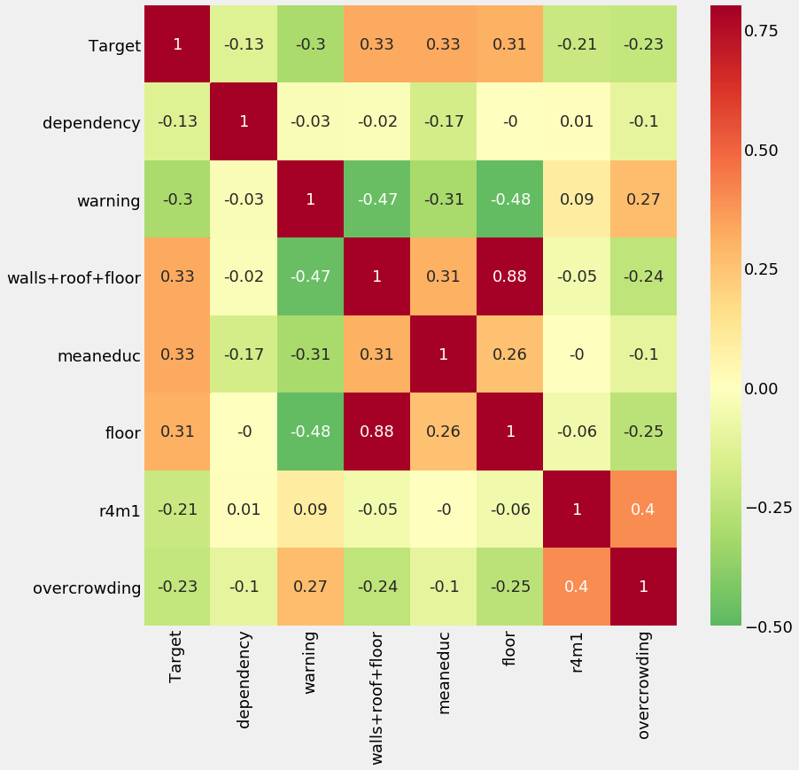
This plot shows us that there are a number of variables that have a weak correlation with the Target. There are also high correlations between some variables (such as floor and walls+roof+floor) which could pose an issue because of collinearity.
household_feats = list(heads.columns)
Individual Level Variables
There are two types of individual level variables: Boolean (1 or 0 for True or False) and ordinal (discrete values with a meaningful ordering)
ind = data[id_ + ind_bool + ind_ordered]
ind.shape
(33413, 40)
Redundant Individual Variables
We can do the same process we did with the household level variables to identify any redundant individual variables. We’ll focus on any variables that have an absolute magnitude of the correlation coefficient greater than 0.95.
# Create correlation matrix
corr_matrix = ind.corr()

# Select upper triangle of correlation matrix
upper = corr_matrix.where(np.triu(np.ones(corr_matrix.shape), k=1).astype(np.bool))

# Find index of feature columns with correlation greater than 0.95
to_drop = [column for column in upper.columns if any(abs(upper[column]) > 0.95)]

to_drop
['female']
This is simply the opposite of male! We can remove the male flag.
ind = ind.drop(columns = 'male')
Creating Ordinal Variables
Much as we did with the household level data, we can map existing columns to an ordinal variable. Here we will focus on the
- instlevel_: variables which indicate the amount of education an individual has from
- instlevel1: no level of education to
- instlevel9: postgraduate education.
To create the ordinal variable, for each individual, we will simply find which column is non-zero. The education has an inherent ordering (higher is better) so this conversion to an ordinal variable makes sense in the problem context.
ind[[c for c in ind if c.startswith('instl')]].head()
| instlevel1 | instlevel2 | instlevel3 | instlevel4 | instlevel5 | instlevel6 | instlevel7 | instlevel8 | instlevel9 | |
|---|---|---|---|---|---|---|---|---|---|
| 0 | 0 | 0 | 0 | 1 | 0 | 0 | 0 | 0 | 0 |
| 1 | 0 | 0 | 0 | 0 | 0 | 0 | 0 | 1 | 0 |
| 2 | 0 | 0 | 0 | 0 | 1 | 0 | 0 | 0 | 0 |
| 3 | 0 | 0 | 0 | 1 | 0 | 0 | 0 | 0 | 0 |
| 4 | 0 | 0 | 0 | 0 | 1 | 0 | 0 | 0 | 0 |
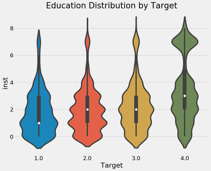
ind['inst'] = np.argmax(np.array(ind[[c for c in ind if c.startswith('instl')]]), axis = 1)

categorical_plot('inst', 'Target', ind, annotate = False);
Higher levels of education seem to correspond to less extreme levels of poverty. We do need to keep in mind this is on an individual level though and we eventually will have to aggregate this data at the household level.
plt.figure(figsize = (10, 8))
sns.violinplot(x = 'Target', y = 'inst', data = ind);
plt.title('Education Distribution by Target');
C:\Anaconda\lib\site-packages\scipy\stats\stats.py:1713: FutureWarning: Using a non-tuple sequence for multidimensional indexing is deprecated; use `arr[tuple(seq)]` instead of `arr[seq]`. In the future this will be interpreted as an array index, `arr[np.array(seq)]`, which will result either in an error or a different result.
  return np.add.reduce(sorted[indexer] * weights, axis=axis) / sumval
ind.shape
(33413, 40)
Feature Construction
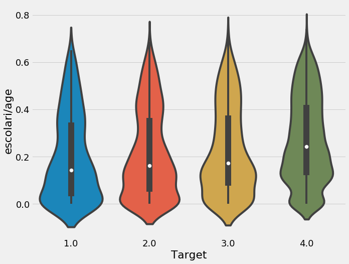
We will make a few features using the existing data by dividing the years of schooling by the age. Which is a good way to see the education and age.
ind['escolari/age'] = ind['escolari'] / ind['age']

plt.figure(figsize = (10, 8))
sns.violinplot('Target', 'escolari/age', data = ind);
C:\Anaconda\lib\site-packages\scipy\stats\stats.py:1713: FutureWarning: Using a non-tuple sequence for multidimensional indexing is deprecated; use `arr[tuple(seq)]` instead of `arr[seq]`. In the future this will be interpreted as an array index, `arr[np.array(seq)]`, which will result either in an error or a different result.
  return np.add.reduce(sorted[indexer] * weights, axis=axis) / sumval
We can also take our new variable, inst, and divide this by the age. The final variable we’ll name tech: this represents the combination of tablet and mobile phones.
ind['inst/age'] = ind['inst'] / ind['age']
ind['tech'] = ind['v18q'] + ind['mobilephone']
ind['tech'].describe()
count    33413.000000
mean         1.214886
std          0.462567
min          0.000000
25%          1.000000
50%          1.000000
75%          1.000000
max          2.000000
Name: tech, dtype: float64
Feature Engineering through Aggregations
In order to incorporate the individual data into the household data, we need to aggregate it for each household.
# Define custom function
range_ = lambda x: x.max() - x.min()
range_.__name__ = 'range_'

# Group and aggregate
ind_agg = ind.drop(columns = 'Target').groupby('idhogar').agg(['min', 'max', 'sum', 'count', 'std', range_])
So now we have 180 features instead of 30 features. W will rename the columns to make it easier to keep track.
# Rename the columns
new_col = []
for c in ind_agg.columns.levels[0]:
    for stat in ind_agg.columns.levels[1]:
        new_col.append(f'{c}-{stat}')

ind_agg.columns = new_col
ind_agg.iloc[:, [0, 1, 2, 3, 6, 7, 8, 9]].head()
| v18q-min | v18q-max | v18q-sum | v18q-count | dis-min | dis-max | dis-sum | dis-count | |
|---|---|---|---|---|---|---|---|---|
| idhogar | ||||||||
| 000a08204 | 1 | 1 | 3 | 3 | 0 | 0 | 0 | 3 |
| 000bce7c4 | 0 | 0 | 0 | 2 | 0 | 1 | 1 | 2 |
| 001845fb0 | 0 | 0 | 0 | 4 | 0 | 0 | 0 | 4 |
| 001ff74ca | 1 | 1 | 2 | 2 | 0 | 0 | 0 | 2 |
| 003123ec2 | 0 | 0 | 0 | 4 | 0 | 0 | 0 | 4 |
Feature Selection
As a first round of feature selection, we can remove one out of every pair of variables with a correlation greater than 0.95.
# Create correlation matrix
corr_matrix = ind_agg.corr()

# Select upper triangle of correlation matrix
upper = corr_matrix.where(np.triu(np.ones(corr_matrix.shape), k=1).astype(np.bool))

# Find index of feature columns with correlation greater than 0.95
to_drop = [column for column in upper.columns if any(abs(upper[column]) > 0.95)]

print(f'There are {len(to_drop)} correlated columns to remove.')
There are 111 correlated columns to remove.
We’ll drop the columns and then merge with the heads data to create a final dataframe.
ind_agg = ind_agg.drop(columns = to_drop)
ind_feats = list(ind_agg.columns)

# Merge on the household id
final = heads.merge(ind_agg, on = 'idhogar', how = 'left')

print('Final features shape: ', final.shape)
Final features shape: (10307, 228)
Final Data Exploration
We’ll do a little bit of exploration.
corrs = final.corr()['Target']
corrs.sort_values().head()
warning          -0.301791
instlevel2-sum   -0.297868
instlevel1-sum   -0.271204
hogar_nin        -0.266309
r4t1             -0.260917
Name: Target, dtype: float64
corrs.sort_values().dropna().tail()
walls+roof+floor    0.332446
meaneduc            0.333652
inst-max            0.368229
escolari-max        0.373091
Target              1.000000
Name: Target, dtype: float64
We can see some of the variables that we made are highly correlated with the Target. Whether these variables are actually useful will be determined in the modeling stage.
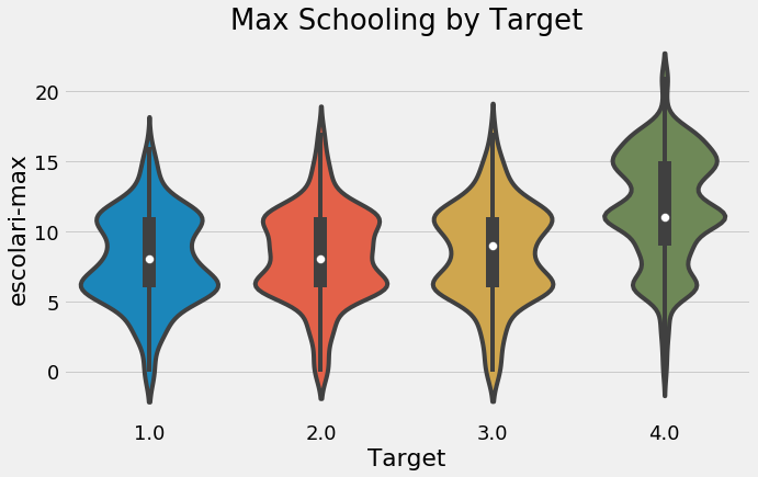
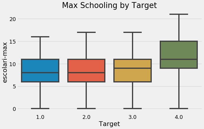
categorical_plot('escolari-max', 'Target', final, annotate=False);
plt.figure(figsize = (10, 6))
sns.violinplot(x = 'Target', y = 'escolari-max', data = final);
plt.title('Max Schooling by Target');
C:\Anaconda\lib\site-packages\scipy\stats\stats.py:1713: FutureWarning: Using a non-tuple sequence for multidimensional indexing is deprecated; use `arr[tuple(seq)]` instead of `arr[seq]`. In the future this will be interpreted as an array index, `arr[np.array(seq)]`, which will result either in an error or a different result.
  return np.add.reduce(sorted[indexer] * weights, axis=axis) / sumval
plt.figure(figsize = (10, 6))
sns.boxplot(x = 'Target', y = 'escolari-max', data = final);
plt.title('Max Schooling by Target');
plt.figure(figsize = (10, 6))
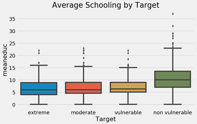
sns.boxplot(x = 'Target', y = 'meaneduc', data = final);
plt.xticks([0, 1, 2, 3], poverty_mapping.values())
plt.title('Average Schooling by Target');
plt.figure(figsize = (10, 6))
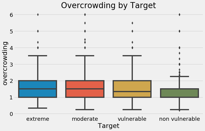
sns.boxplot(x = 'Target', y = 'overcrowding', data = final);
plt.xticks([0, 1, 2, 3], poverty_mapping.values())
plt.title('Overcrowding by Target');
One other feature that might be useful is the gender of the head of household. Since we aggregated the data, we’ll have to go back to the individual level data and find the gender for the head of household.
head_gender = ind.loc[ind['parentesco1'] == 1, ['idhogar', 'female']]
final = final.merge(head_gender, on = 'idhogar', how = 'left').rename(columns =
                                                                      {'female': 'female-head'})
final.groupby('female-head')['Target'].value_counts(normalize=True)
female-head  Target
0            4.0       0.682873
             2.0       0.136464
             3.0       0.123204
             1.0       0.057459
1            4.0       0.617369
             2.0       0.167670
             3.0       0.113500
             1.0       0.101462
Name: Target, dtype: float64
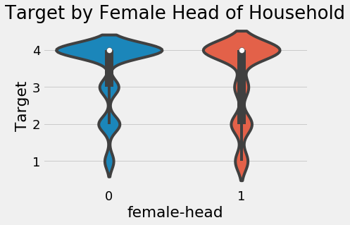
It looks like households where the head is female are slightly more likely to have a severe level of poverty.
sns.violinplot(x = 'female-head', y = 'Target', data = final);
plt.title('Target by Female Head of Household');
C:\Anaconda\lib\site-packages\scipy\stats\stats.py:1713: FutureWarning: Using a non-tuple sequence for multidimensional indexing is deprecated; use `arr[tuple(seq)]` instead of `arr[seq]`. In the future this will be interpreted as an array index, `arr[np.array(seq)]`, which will result either in an error or a different result.
  return np.add.reduce(sorted[indexer] * weights, axis=axis) / sumval
We will also look at the difference in average education by whether or not the family has a female head of household.
plt.figure(figsize = (8, 8))
sns.boxplot(x = 'Target', y = 'meaneduc', hue = 'female-head', data = final);
plt.title('Average Education by Target and Female Head of Household', size = 16);
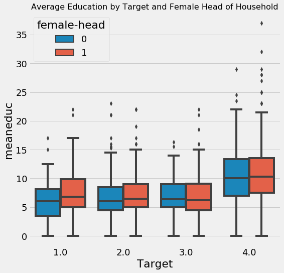
It looks like at every value of the Target, households with female heads have higher levels of education. Yet, we saw that overall, households with female heads are more likely to have severe poverty.
final.groupby('female-head')['meaneduc'].agg(['mean', 'count'])
| mean | count | |
|---|---|---|
| female-head | ||
| 0 | 8.968025 | 6384 |
| 1 | 9.237013 | 3903 |
Overall, the average education of households with female heads is slightly higher than those with male heads. I’m not too sure what to make of this, but it seems right to me.
Machine Learning Modeling
To assess our model, we’ll use 10-fold cross validation on the training data. This will essentially train and test the model 10 times using different splits of the training data. 10-fold cross validation is an effective method for estimating the performance of a model on the test set. We want to look at the average performance in cross validation as well as the standard deviation to see how much scores change between the folds. We use the F1 Macro measure to evaluate performance.
from sklearn.ensemble import RandomForestClassifier
from sklearn.metrics import f1_score, make_scorer
from sklearn.model_selection import cross_val_score
from sklearn.preprocessing import Imputer
from sklearn.preprocessing import MinMaxScaler
from sklearn.pipeline import Pipeline

# Custom scorer for cross validation
scorer = make_scorer(f1_score, greater_is_better=True, average = 'macro')
C:\Anaconda\lib\site-packages\sklearn\ensemble\weight_boosting.py:29: DeprecationWarning: numpy.core.umath_tests is an internal NumPy module and should not be imported. It will be removed in a future NumPy release.
  from numpy.core.umath_tests import inner1d
# Labels for training
train_labels = np.array(list(final[final['Target'].notnull()]['Target'].astype(np.uint8)))

# Extract the training data
train_set = final[final['Target'].notnull()].drop(columns = ['Id', 'idhogar', 'Target'])
test_set = final[final['Target'].isnull()].drop(columns = ['Id', 'idhogar', 'Target'])

# Submission base which is used for making submissions to the competition
submission_base = test[['Id', 'idhogar']].copy()
We will be comparing different models, So we want to scale the features (limit the range of each column to between 0 and 1). For many ensemble models this is not necessary, but when we use models that depend on a distance metric, such as KNearest Neighbors or the Support Vector Machine, feature scaling is an absolute necessity. When comparing different models, it’s always safest to scale the features. We also impute the missing values with the median of the feature.
For imputing missing values and scaling the features in one step, we can make a pipeline. This will be fit on the training data and used to transform the training and testing data.
features = list(train_set.columns)

pipeline = Pipeline([('imputer', Imputer(strategy = 'median')),
                      ('scaler', MinMaxScaler())])

# Fit and transform training data
train_set = pipeline.fit_transform(train_set)
test_set = pipeline.transform(test_set)
model = RandomForestClassifier(n_estimators=100, random_state=10,
                               n_jobs = -1)
# 10 fold cross validation
cv_score = cross_val_score(model, train_set, train_labels, cv = 10, scoring = scorer)

print(f'10 Fold Cross Validation F1 Score = {round(cv_score.mean(), 4)} with std = {round(cv_score.std(), 4)}')
10 Fold Cross Validation F1 Score = 0.3425 with std = 0.0322
The data has no missing values and is scaled between zero and one. This means it can be directly used in any Scikit-Learn model.
Feature Importances
With a tree-based model, we can look at the feature importances which show a relative ranking of the usefulness of features in the model. These represent the sum of the reduction in impurity at nodes that used the variable for splitting, but we don’t have to pay much attention to the absolute value. Instead we’ll focus on relative scores.
model.fit(train_set, train_labels)

# Feature importances into a dataframe
feature_importances = pd.DataFrame({'feature': features, 'importance': model.feature_importances_})
feature_importances.head()
| feature | importance | |
|---|---|---|
| 0 | hacdor | 0.000643 |
| 1 | hacapo | 0.000283 |
| 2 | v14a | 0.000460 |
| 3 | refrig | 0.001798 |
| 4 | paredblolad | 0.006024 |
# Import Function to plot the feature importances
from costarican.featurePlot import feature_importances_plot
norm_fi = feature_importances_plot(feature_importances, threshold=0.95)
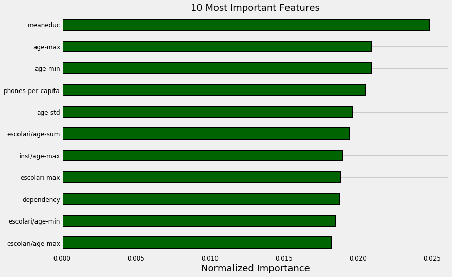
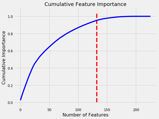
132 features required for 95% of cumulative importance.
The most important variable is the average amount of education in the household, followed by the maximum education of anyone in the household. I have a suspicion these variables are highly correlated (collinear) which means we may want to remove one of them from the data. The other most important features are a combination of variables we created and variables that were already present in the data.
It’s interesting that we only need 132 of the ~180 features to account for 95% of the importance. This tells us that we may be able to remove some of the features. However, feature importances don’t tell us which direction of the feature is important (for example, we can’t use these to tell whether more or less education leads to more severe poverty) they only tell us which features the model considered relevant.
# Import function to plot the distribution of variables
from costarican.distributionPlot import kde_target
kde_target(final, 'meaneduc')
C:\Anaconda\lib\site-packages\scipy\stats\stats.py:1713: FutureWarning: Using a non-tuple sequence for multidimensional indexing is deprecated; use `arr[tuple(seq)]` instead of `arr[seq]`. In the future this will be interpreted as an array index, `arr[np.array(seq)]`, which will result either in an error or a different result.
  return np.add.reduce(sorted[indexer] * weights, axis=axis) / sumval
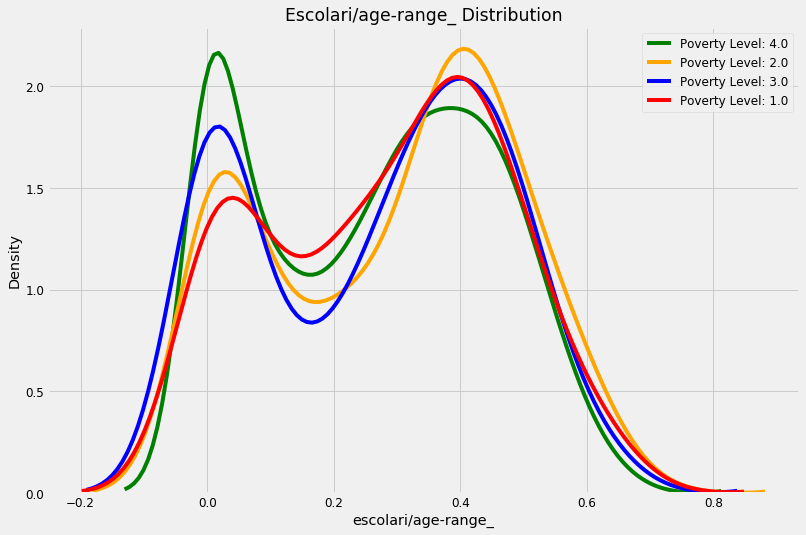
kde_target(final, 'escolari/age-range_')
C:\Anaconda\lib\site-packages\scipy\stats\stats.py:1713: FutureWarning: Using a non-tuple sequence for multidimensional indexing is deprecated; use `arr[tuple(seq)]` instead of `arr[seq]`. In the future this will be interpreted as an array index, `arr[np.array(seq)]`, which will result either in an error or a different result.
  return np.add.reduce(sorted[indexer] * weights, axis=axis) / sumval
Model Selection
In addition to the Random Forest Classifier, we’ll try eight other Scikit-Learn models. Luckily, this dataset is relatively small and we can rapidly iterate through the models. We will make a dataframe to hold the results and the function will add a row to the dataframe for each model.
# Model imports
from sklearn.svm import LinearSVC
from sklearn.naive_bayes import GaussianNB
from sklearn.neural_network import MLPClassifier
from sklearn.linear_model import LogisticRegressionCV, RidgeClassifierCV
from sklearn.discriminant_analysis import LinearDiscriminantAnalysis
from sklearn.neighbors import KNeighborsClassifier
import warnings
from sklearn.exceptions import ConvergenceWarning

# Filter out warnings from models
warnings.filterwarnings('ignore', category = ConvergenceWarning)
warnings.filterwarnings('ignore', category = DeprecationWarning)
warnings.filterwarnings('ignore', category = UserWarning)

# Dataframe to hold results
model_results = pd.DataFrame(columns = ['model', 'cv_mean', 'cv_std'])

def cv_model(train, train_labels, model, name, model_results=None):
    """Perform 10 fold cross validation of a model"""

    cv_scores = cross_val_score(model, train, train_labels, cv = 10, scoring=scorer, n_jobs = -1)
    print(f'10 Fold CV Score: {round(cv_scores.mean(), 5)} with std: {round(cv_scores.std(), 5)}')

    if model_results is not None:
        model_results = model_results.append(pd.DataFrame({'model': name,
                                                           'cv_mean': cv_scores.mean(),
                                                            'cv_std': cv_scores.std()},
                                                           index = [0]),
                                             ignore_index = True)

        return model_results
model_results = cv_model(train_set, train_labels, LinearSVC(),
                         'LSVC', model_results)
10 Fold CV Score: 0.28346 with std: 0.04484
That’s one model to cross off the list (although we didn’t perform hyperparameter tuning so the actual performance could possibly be improved).
model_results = cv_model(train_set, train_labels,
                         GaussianNB(), 'GNB', model_results)
10 Fold CV Score: 0.17935 with std: 0.03867
That performance is very poor. I don’t think we need to revisit the Gaussian Naive Bayes method (although there are problems on which it can outperform the Gradient Boosting Machine).
model_results = cv_model(train_set, train_labels,
                          LinearDiscriminantAnalysis(),
                          'LDA', model_results)
10 Fold CV Score: 0.32217 with std: 0.05984
If you run LinearDiscriminantAnalysis without filtering out the UserWarnings, you get many messages saying “Variables are collinear.” This might give us a hint that we want to remove some collinear features! We might want to try this model again after removing the collinear variables because the score is comparable to the random forest.
model_results = cv_model(train_set, train_labels,
                         RidgeClassifierCV(), 'RIDGE', model_results)
10 Fold CV Score: 0.27896 with std: 0.03675
The linear model (with ridge regularization) does surprisingly well. This might indicate that a simple model can go a long way in this problem (although we’ll probably end up using a more powerful method).
for n in [5, 10, 20]:
    print(f'\nKNN with {n} neighbors\n')
    model_results = cv_model(train_set, train_labels,
                             KNeighborsClassifier(n_neighbors = n),
                             f'knn-{n}', model_results)
KNN with 5 neighbors

10 Fold CV Score: 0.35078 with std: 0.03829

KNN with 10 neighbors

10 Fold CV Score: 0.32153 with std: 0.03028

KNN with 20 neighbors

10 Fold CV Score: 0.31039 with std: 0.04974
As one more attempt, we’ll consider the ExtraTreesClassifier, a variant on the random forest using ensembles of decision trees as well.
from sklearn.ensemble import ExtraTreesClassifier

model_results = cv_model(train_set, train_labels,
                         ExtraTreesClassifier(n_estimators = 100, random_state = 10),
                         'EXT', model_results)
10 Fold CV Score: 0.32215 with std: 0.04671
Comparing Model Performance
With the modeling results in a dataframe, we can plot them to see which model does the best.
model_results = cv_model(train_set, train_labels,
                          RandomForestClassifier(100, random_state=10),
                              'RF', model_results)
10 Fold CV Score: 0.34245 with std: 0.03221
model_results.set_index('model', inplace = True)
model_results['cv_mean'].plot.bar(color = 'orange', figsize = (8, 6),
                                  yerr = list(model_results['cv_std']),
                                  edgecolor = 'k', linewidth = 2)
plt.title('Model F1 Score Results');
plt.ylabel('Mean F1 Score (with error bar)');
model_results.reset_index(inplace = True)
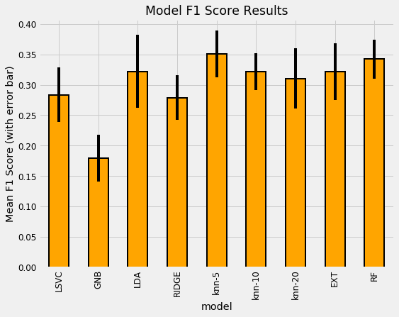
The most well performed model seems to be the Random Forest because it does best right out of the box. While we didn’t tune any of the hyperparameters so the comparison between models is not perfect, these results reflect those of many other Kaggle competitiors finding that tree-based ensemble methods (including the Gradient Boosting Machine) perform very well on structured datasets. Hyperparameter performance does improve the performance of machine learning models, but we don’t have time to try all possible combinations of settings for all models. The graph below (from the paper by Randal Olson) shows the effect of hyperparameter tuning versus the default values in Scikit-Learn.
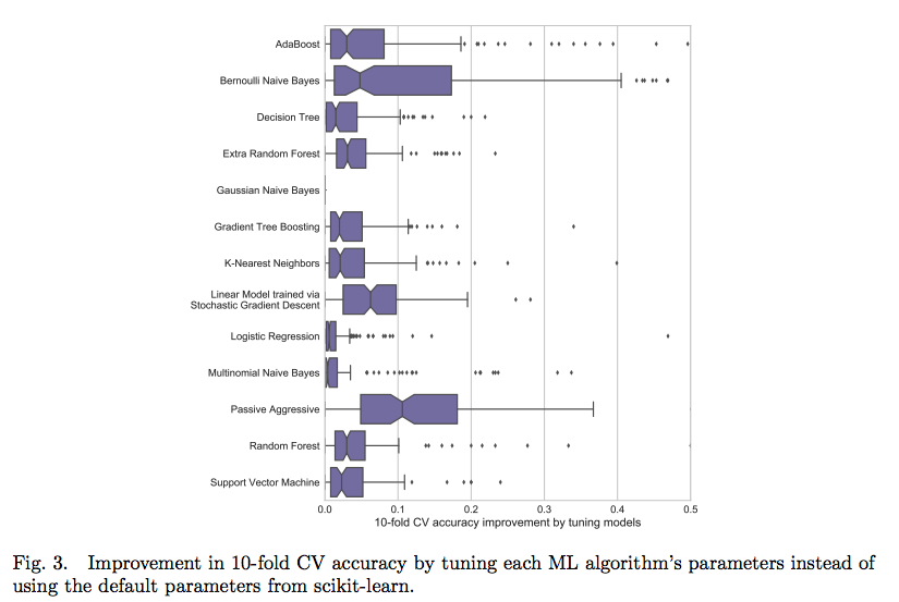
In most cases the accuracy gain is less than 10% so the worst model is probably not suddenly going to become the best model through tuning.
For now we’ll say the random forest does the best. Later we’ll look at using the Gradient Boosting Machine, although not implemented in Scikit-Learn. Instead we’ll be using the more powerful LightGBM version. Now, let’s turn to making a submission using the random forest.
Performance
In order to see the performance of our model, we need the test data. Fortunately, we have the test data formatted in exactly the same manner as the train data.
The format of a testing the output is shown below. Although we are making predictions for each household, we actually need one row per individual (identified by the Id) but only the prediction for the head of household is scored.
Id, Target
- ID_2f6873615, 1
- ID_1c78846d2, 2
- ID_e5442cf6a, 3
- ID_a8db26a79, 4
- ID_a62966799, 4
The submission_base will have all the individuals in the test set since we have to have a “prediction” for each individual while the test_ids will only contain the idhogar from the heads of households. When predicting, we only predict for each household and then we merge the predictions dataframe with all of the individuals on the household id (idhogar). This will set the Target to the same value for everyone in a household. For the test households without a head of household, we can just set these predictions to 4 since they will not be scored.
test_ids = list(final.loc[final['Target'].isnull(), 'idhogar'])
def submit(model, train, train_labels, test, test_ids):
    """Train and test a model on the dataset"""

    # Train on the data
    model.fit(train, train_labels)
    predictions = model.predict(test)
    predictions = pd.DataFrame({'idhogar': test_ids,
                               'Target': predictions})

     # Make a submission dataframe
    submission = submission_base.merge(predictions,
                                       on = 'idhogar',
                                       how = 'left').drop(columns = ['idhogar'])

    # Fill in households missing a head
    submission['Target'] = submission['Target'].fillna(4).astype(np.int8)

    return submission
Let’s make a prediction n with the Random Forest.
rf_submission = submit(RandomForestClassifier(n_estimators = 100,
                                              random_state=10, n_jobs = -1),
                         train_set, train_labels, test_set, test_ids)

rf_submission.to_csv('rf_submission.csv', index = False)
These predictions score 0.360 when submitted to the competition.
Feature Selection
We’ll remove any columns with greater than 0.95 correlation and then we’ll apply recursive feature elimination with the Scikit-Learn library.
First up are the correlations. 0.95 is an arbitrary threshold.
train_set = pd.DataFrame(train_set, columns = features)

# Create correlation matrix
corr_matrix = train_set.corr()

# Select upper triangle of correlation matrix
upper = corr_matrix.where(np.triu(np.ones(corr_matrix.shape), k=1).astype(np.bool))

# Find index of feature columns with correlation greater than 0.95
to_drop = [column for column in upper.columns if any(abs(upper[column]) > 0.95)]

to_drop
['coopele', 'elec', 'v18q-count', 'female-sum']
train_set = train_set.drop(columns = to_drop)
train_set.shape
(2973, 222)
test_set = pd.DataFrame(test_set, columns = features)
train_set, test_set = train_set.align(test_set, axis = 1, join = 'inner')
features = list(train_set.columns)
Recursive Feature Elimination with Random Forest
The RFECV in Sklearn stands for Recursive Feature Elimination with Cross Validation. The selector operates using a model with feature importances in an iterative manner. At each iteration, it removes either a fraction of features or a set number of features. The iterations continue until the cross validation score no longer improves.
To create the selector object, we pass in the the model, the number of features to remove at each iteration, the cross validation folds, our custom scorer, and any other parameters to guide the selection.
from sklearn.feature_selection import RFECV

# Create a model for feature selection
estimator = RandomForestClassifier(random_state = 10, n_estimators = 100,  n_jobs = -1)

# Create the object
selector = RFECV(estimator, step = 1, cv = 3, scoring= scorer, n_jobs = -1)
Then we fit the selector on the training data as with any other sklearn model. This will continue the feature selection until the cross validation scores no longer improve.
selector.fit(train_set, train_labels)
RFECV(cv=3,
   estimator=RandomForestClassifier(bootstrap=True, class_weight=None, criterion='gini',
            max_depth=None, max_features='auto', max_leaf_nodes=None,
            min_impurity_decrease=0.0, min_impurity_split=None,
            min_samples_leaf=1, min_samples_split=2,
            min_weight_fraction_leaf=0.0, n_estimators=100, n_jobs=-1,
            oob_score=False, random_state=10, verbose=0, warm_start=False),
   n_jobs=-1, scoring=make_scorer(f1_score, average=macro), step=1,
   verbose=0)
We can investigate the object to see the training scores for each iteration. The following code will plot the validation scores versus the number of features for the training.
plt.plot(selector.grid_scores_);

plt.xlabel('Number of Features'); plt.ylabel('Macro F1 Score'); plt.title('Feature Selection Scores');
selector.n_features_
63
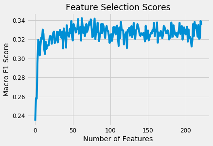
From the plot we can see that the score improves as we add features up until around 95 features. According to the selector, this is the optimal number of features.
The rankings of each feature can be found by inspecting the trained object. These represent essentially the importance of features averaged over the iterations. Features can share the same ranking, and only features with a rank of 1 are retained.
rankings = pd.DataFrame({'feature': list(train_set.columns), 'rank': list(selector.ranking_)}).sort_values('rank')
rankings.head(10)
| feature | rank | |
|---|---|---|
| 73 | r4h2 | 1 |
| 130 | estadocivil7-std | 1 |
| 129 | estadocivil7-sum | 1 |
| 198 | escolari-sum | 1 |
| 197 | escolari-max | 1 |
| 86 | bedrooms | 1 |
| 177 | instlevel4-std | 1 |
| 109 | female-std | 1 |
| 106 | dis-sum | 1 |
| 187 | instlevel8-sum | 1 |
After seeing the ranking of the feature finally, we can select the features and then evaluate in cross validation.
train_selected = selector.transform(train_set)
test_selected = selector.transform(test_set)
# Convert back to dataframe
selected_features = train_set.columns[np.where(selector.ranking_==1)]
train_selected = pd.DataFrame(train_selected, columns = selected_features)
test_selected = pd.DataFrame(test_selected, columns = selected_features)
model_results = cv_model(train_selected, train_labels, model, 'RF-SEL', model_results)
10 Fold CV Score: 0.36276 with std: 0.04094
model_results.set_index('model', inplace = True)
model_results['cv_mean'].plot.bar(color = 'orange', figsize = (8, 6),
                                  yerr = list(model_results['cv_std']),
                                 edgecolor = 'k', linewidth = 2)
plt.title('Model F1 Score Results');
plt.ylabel('Mean F1 Score (with error bar)');
model_results.reset_index(inplace = True)
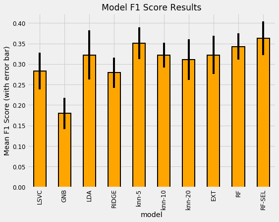
We can see that the Random Forest model with selected features performs slightly better in cross-validation. We can keep both sets of features for use in our next model, the Gradient Boosting Machine.
Upgrading ML Model: Gradient Boosting Machine
After using the Random Forest and getting decent scores. Now we will step up and use the gradient boosting machine because when data is structured (in tables) and the datasets are not that large (less than a million observations) then Gradient Boosting Machine perform better than the other models.
We’ll use the GBM in LightGBM, although there are also options in Scikit-Learn, XGBOOST, and CatBoost.
Choosing Number of Estimators with Early Stopping
To choose the number of estimators (the number of decision trees in the ensemble, called n_estimators or num_boost_rounds), we’ll use early stopping with 5-fold cross validation. This will keep adding estimators until the performance as measured by the Macro F1 Score has not increased for 100 training rounds.
Light Gradient Boosting Machine Implementation
The package below implements training the gradient boosting machine with Stratified Kfold cross validation and early stopping to prevent overfitting to the training data. The function performs training with cross validation and records the predictions in probability for each fold. To see how this works, we can return the predictions from each fold and then we’ll return a submission to upload to the competition.
We’ll use a set of hyperparameters that I’ve found work well on previous problems.
We set the n_estimators to 10000 but we won’t actually reach this number because we are using early stopping which will quit training estimators when the cross validation metric does not improve for early_stopping_rounds. The display is used to show custom information during training in combination with %%capture so we don’t have to see all the LightGBM information during training.
Cross Validation with Early Stopping Notes
Cross validation with early stopping is one of the most effective methods for preventing overfitting on the training set because it prevents us from continuing to add model complexity once it is clear that validation scores are not improving. Repeating this process across multiple folds helps to reduce the bias that comes from using a single fold. Early stopping also lets us train the model much quicker. Overall, early stopping with cross validation is the best method to select the number of estimators in the Gradient Boosting Machine and should be our default technique when we design an implementation.
def macro_f1_score(labels, predictions):
    # Reshape the predictions as needed
    predictions = predictions.reshape(len(np.unique(labels)), -1 ).argmax(axis = 0)

    metric_value = f1_score(labels, predictions, average = 'macro')

    # Return is name, value, is_higher_better
    return 'macro_f1', metric_value, True
# GBM function
from sklearn.model_selection import StratifiedKFold
import lightgbm as lgb
from IPython.display import display

def model_gbm(features, labels, test_features, test_ids,
              nfolds = 5, return_preds = False, hyp = None):
    """Model using the GBM and cross validation.
       Trains with early stopping on each fold.
       Hyperparameters probably need to be tuned."""

    feature_names = list(features.columns)

    # Option for user specified hyperparameters
    if hyp is not None:
        # Using early stopping so do not need number of esimators
        if 'n_estimators' in hyp:
            del hyp['n_estimators']
        params = hyp

    else:
        # Model hyperparameters
        params = {'boosting_type': 'dart',
                  'colsample_bytree': 0.88,
                  'learning_rate': 0.028,
                   'min_child_samples': 10,
                   'num_leaves': 36, 'reg_alpha': 0.76,
                   'reg_lambda': 0.43,
                   'subsample_for_bin': 40000,
                   'subsample': 0.54,
                   'class_weight': 'balanced'}

    # Build the model
    model = lgb.LGBMClassifier(**params, objective = 'multiclass',
                               n_jobs = -1, n_estimators = 10000,
                               random_state = 10)

    # Using stratified kfold cross validation
    strkfold = StratifiedKFold(n_splits = nfolds, shuffle = True)

    # Hold all the predictions from each fold
    predictions = pd.DataFrame()
    importances = np.zeros(len(feature_names))

    # Convert to arrays for indexing
    features = np.array(features)
    test_features = np.array(test_features)
    labels = np.array(labels).reshape((-1 ))

    valid_scores = []

    # Iterate through the folds
    for i, (train_indices, valid_indices) in enumerate(strkfold.split(features, labels)):

        # Dataframe for fold predictions
        fold_predictions = pd.DataFrame()

        # Training and validation data
        X_train = features[train_indices]
        X_valid = features[valid_indices]
        y_train = labels[train_indices]
        y_valid = labels[valid_indices]

        # Train with early stopping
        model.fit(X_train, y_train, early_stopping_rounds = 100,
                  eval_metric = macro_f1_score,
                  eval_set = [(X_train, y_train), (X_valid, y_valid)],
                  eval_names = ['train', 'valid'],
                  verbose = 200)

        # Record the validation fold score
        valid_scores.append(model.best_score_['valid']['macro_f1'])

        # Make predictions from the fold as probabilities
        fold_probabilitites = model.predict_proba(test_features)

        # Record each prediction for each class as a separate column
        for j in range(4):
            fold_predictions[(j + 1)] = fold_probabilitites[:, j]

        # Add needed information for predictions
        fold_predictions['idhogar'] = test_ids
        fold_predictions['fold'] = (i+1)

        # Add the predictions as new rows to the existing predictions
        predictions = predictions.append(fold_predictions)

        # Feature importances
        importances += model.feature_importances_ / nfolds

        # Display fold information
        display(f'Fold {i + 1}, Validation Score: {round(valid_scores[i], 5)}, Estimators Trained: {model.best_iteration_}')

    # Feature importances dataframe
    feature_importances = pd.DataFrame({'feature': feature_names,
                                        'importance': importances})

    valid_scores = np.array(valid_scores)
    display(f'{nfolds} cross validation score: {round(valid_scores.mean(), 5)} with std: {round(valid_scores.std(), 5)}.')

    # If we want to examine predictions don't average over folds
    if return_preds:
        predictions['Target'] = predictions[[1, 2, 3, 4]].idxmax(axis = 1)
        predictions['confidence'] = predictions[[1, 2, 3, 4]].max(axis = 1)
        return predictions, feature_importances

    # Average the predictions over folds
    predictions = predictions.groupby('idhogar', as_index = False).mean()

    # Find the class and associated probability
    predictions['Target'] = predictions[[1, 2, 3, 4]].idxmax(axis = 1)
    predictions['confidence'] = predictions[[1, 2, 3, 4]].max(axis = 1)
    predictions = predictions.drop(columns = ['fold'])

    # Merge with the base to have one prediction for each individual
    submission = submission_base.merge(predictions[['idhogar', 'Target']], on = 'idhogar', how = 'left').drop(columns = ['idhogar'])

    # Fill in the individuals that do not have a head of household with 4 since these will not be scored
    submission['Target'] = submission['Target'].fillna(4).astype(np.int8)

    # return the submission and feature importances along with validation scores
    return submission, feature_importances, valid_scores
%%capture --no-display
predictions, gbm_fi = model_gbm(train_set, train_labels, test_set, test_ids, return_preds=True)
'Fold 1, Validation Score: 0.42909, Estimators Trained: 8'


'Fold 2, Validation Score: 0.40221, Estimators Trained: 123'


'Fold 3, Validation Score: 0.42597, Estimators Trained: 13'


'Fold 4, Validation Score: 0.41637, Estimators Trained: 181'


'Fold 5, Validation Score: 0.4109, Estimators Trained: 65'


'5 cross validation score: 0.41691 with std: 0.00983.'
We can see that the cross validation score is very good from our earlier model.
Let’s take a look at the predictions to understand what is going on with the predictions in each fold.
predictions.head()
| 1 | 2 | 3 | 4 | idhogar | fold | Target | confidence | |
|---|---|---|---|---|---|---|---|---|
| 0 | 0.241276 | 0.240589 | 0.241482 | 0.276653 | 72958b30c | 1 | 4 | 0.276653 |
| 1 | 0.243531 | 0.238617 | 0.240120 | 0.277731 | 5b598fbc9 | 1 | 4 | 0.277731 |
| 2 | 0.247284 | 0.250310 | 0.245527 | 0.256878 | 1e2fc704e | 1 | 4 | 0.256878 |
| 3 | 0.245080 | 0.243795 | 0.245707 | 0.265419 | 8ee7365a8 | 1 | 4 | 0.265419 |
| 4 | 0.240188 | 0.239561 | 0.241070 | 0.279182 | ff69a6fc8 | 1 | 4 | 0.279182 |
For each fold, the 1, 2, 3, 4 columns represent the probability for each Target. The Target is the maximum of these with the confidence the probability. We have the predictions for all 5 folds, so we can plot the confidence in each Target for the different folds.
plt.rcParams['font.size'] = 18

# Kdeplot
g = sns.FacetGrid(predictions, row = 'fold', hue = 'Target', size = 3, aspect = 4)
g.map(sns.kdeplot, 'confidence');
g.add_legend();

plt.suptitle('Distribution of Confidence by Fold and Target', y = 1.05);
C:\Anaconda\lib\site-packages\scipy\stats\stats.py:1713: FutureWarning: Using a non-tuple sequence for multidimensional indexing is deprecated; use `arr[tuple(seq)]` instead of `arr[seq]`. In the future this will be interpreted as an array index, `arr[np.array(seq)]`, which will result either in an error or a different result.
  return np.add.reduce(sorted[indexer] * weights, axis=axis) / sumval
What we see here is that the confidence for each class is relatively low. It appears that the model has greater confidence in Target=4 predictions which makes sense because of the class imbalance and the high prevalence of this label.
We will look at the information using a violinplot. This shows the same information, with the number of observations related to the width of the plot.
plt.figure(figsize = (24, 12))
sns.violinplot(x = 'Target', y = 'confidence', hue = 'fold', data = predictions);
C:\Anaconda\lib\site-packages\scipy\stats\stats.py:1713: FutureWarning: Using a non-tuple sequence for multidimensional indexing is deprecated; use `arr[tuple(seq)]` instead of `arr[seq]`. In the future this will be interpreted as an array index, `arr[np.array(seq)]`, which will result either in an error or a different result.
  return np.add.reduce(sorted[indexer] * weights, axis=axis) / sumval
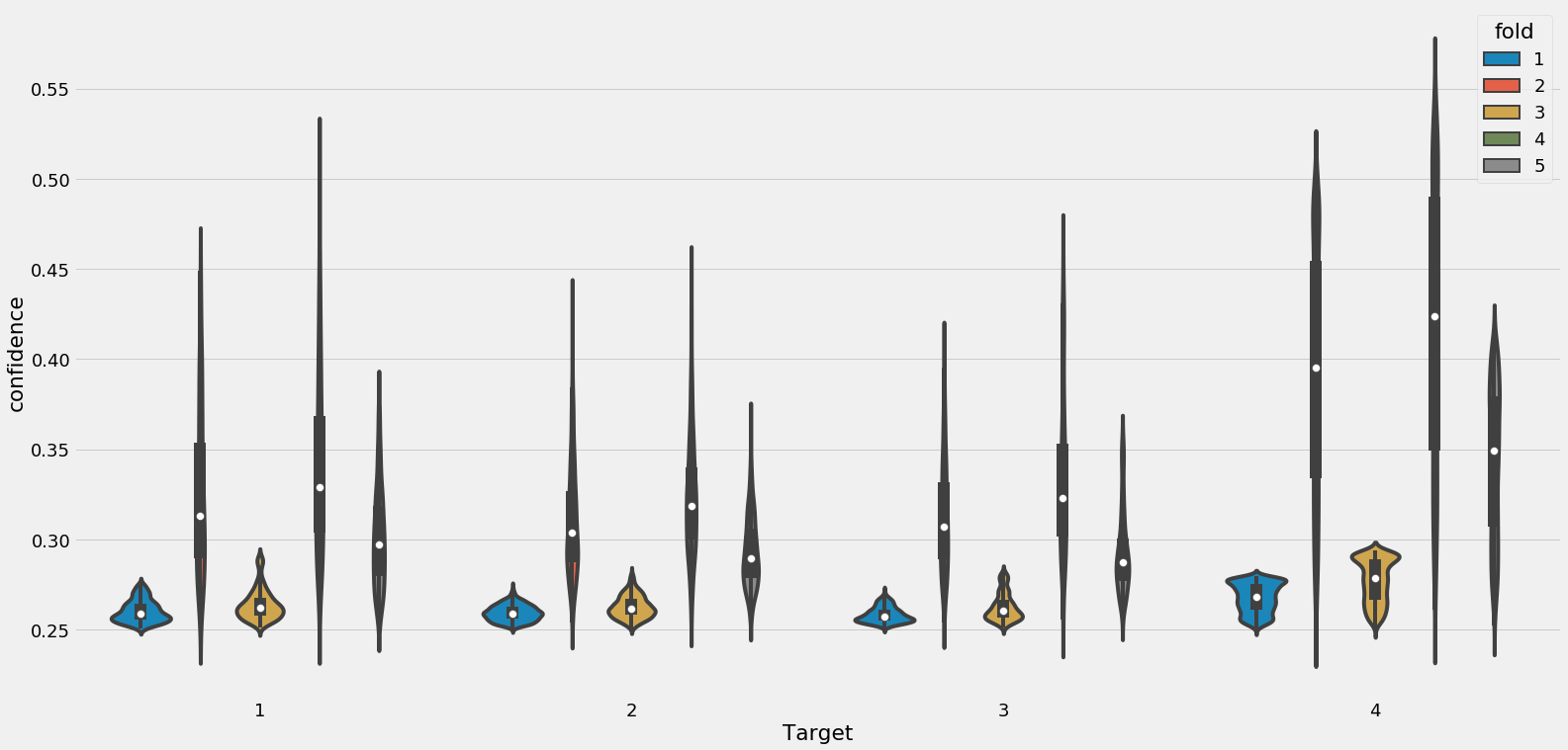
These results show the issue with imbalanced class problems that our model cannot distinguish very well between the classes that are underrepresented
When we actually make predictions for each household, we average the predictions from each of the folds. Therefore, we are essentially using multiple models since each one is trained on a slightly different fold of the data. The gradient boosting machine is already an ensemble machine learning model, and now we are using it almost as a meta-ensemble by averaging predictions from several gbms.
## The process is shown in the code below.
# Average the predictions over folds
predictions = predictions.groupby('idhogar', as_index = False).mean()

# Find the class and associated probability
predictions['Target'] = predictions[[1, 2, 3, 4]].idxmax(axis = 1)
predictions['confidence'] = predictions[[1, 2, 3, 4]].max(axis = 1)
predictions = predictions.drop(columns = ['fold'])

# Plot the confidence by each target
plt.figure(figsize = (10, 6))
sns.boxplot(x = 'Target', y = 'confidence', data = predictions);
plt.title('Confidence by Target');

plt.figure(figsize = (10, 6))
sns.violinplot(x = 'Target', y = 'confidence', data = predictions);
plt.title('Confidence by Target');
C:\Anaconda\lib\site-packages\scipy\stats\stats.py:1713: FutureWarning: Using a non-tuple sequence for multidimensional indexing is deprecated; use `arr[tuple(seq)]` instead of `arr[seq]`. In the future this will be interpreted as an array index, `arr[np.array(seq)]`, which will result either in an error or a different result.
  return np.add.reduce(sorted[indexer] * weights, axis=axis) / sumval
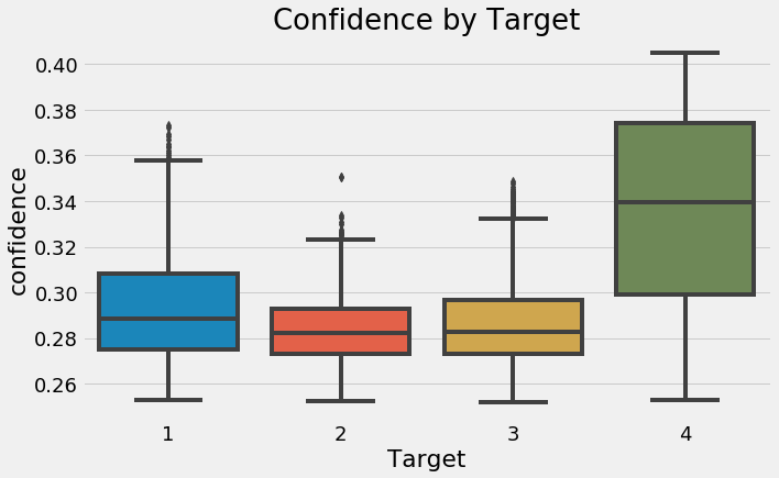
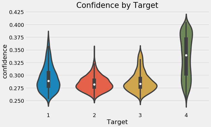
%%capture
submission, gbm_fi, valid_scores = model_gbm(train_set, train_labels,
                                             test_set, test_ids, return_preds=False)
_ = feature_importances_plot(gbm_fi, threshold=0.95)
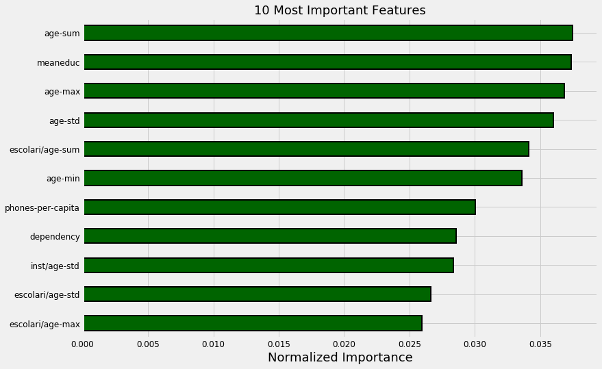
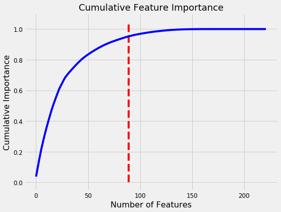
89 features required for 95% of cumulative importance.
The gbm seems to think the most important features are those derived from ages. The education variables also show up in the most important features.
Try Selected Features
The next step with the LightGBM is to try the features that were selected through recursive feature elimination.
%%capture --no-display
submission, gbm_fi_selected, valid_scores_selected = model_gbm(train_selected, train_labels,
                                                               test_selected, test_ids)
'Fold 1, Validation Score: 0.39018, Estimators Trained: 63'


'Fold 2, Validation Score: 0.40779, Estimators Trained: 52'


'Fold 3, Validation Score: 0.42876, Estimators Trained: 222'


'Fold 4, Validation Score: 0.42311, Estimators Trained: 97'


'Fold 5, Validation Score: 0.44073, Estimators Trained: 21'


'5 cross validation score: 0.41811 with std: 0.01753.'
model_results = model_results.append(pd.DataFrame({'model': ["GBM", "GBM_SEL"],
                                                   'cv_mean': [valid_scores.mean(), valid_scores_selected.mean()],
                                                   'cv_std':  [valid_scores.std(), valid_scores_selected.std()]}),
                                                sort = True)
model_results.set_index('model', inplace = True)
model_results['cv_mean'].plot.bar(color = 'orange', figsize = (8, 6),
                                  yerr = list(model_results['cv_std']),
                                 edgecolor = 'k', linewidth = 2)
plt.title('Model F1 Score Results');
plt.ylabel('Mean F1 Score (with error bar)');
model_results.reset_index(inplace = True)
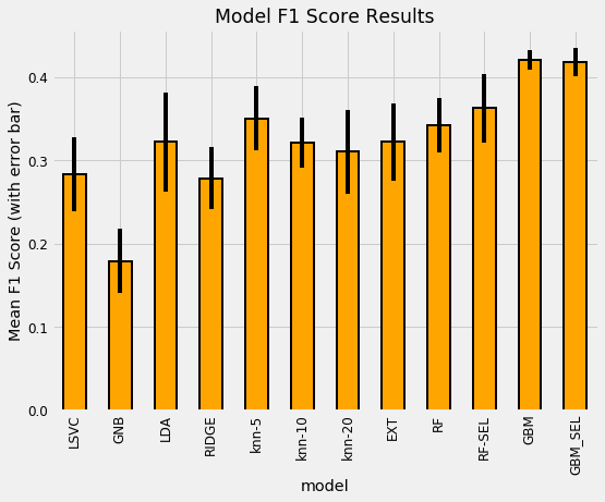
The massive advantage of the gradient boosting machine is on display here. For a final step, let’s try using 10-folds with both sets and add them to the plot.
%%capture
submission, gbm_fi, valid_scores = model_gbm(train_set, train_labels, test_set, test_ids,
                                             nfolds=10, return_preds=False)
%%capture
submission, gbm_fi_selected, valid_scores_selected = model_gbm(train_selected, train_labels, test_selected, test_ids,
                                                               nfolds=10)
model_results = model_results.append(pd.DataFrame({'model': ["GBM_10Fold", "GBM_10Fold_SEL"],
                                                   'cv_mean': [valid_scores.mean(), valid_scores_selected.mean()],
                                                   'cv_std':  [valid_scores.std(), valid_scores_selected.std()]}),
                                    sort = True)
model_results.set_index('model', inplace = True)
model_results['cv_mean'].plot.bar(color = 'orange', figsize = (8, 6),
                                  edgecolor = 'k', linewidth = 2,
                                  yerr = list(model_results['cv_std']))
plt.title('Model F1 Score Results');
plt.ylabel('Mean F1 Score (with error bar)');
model_results.reset_index(inplace = True)
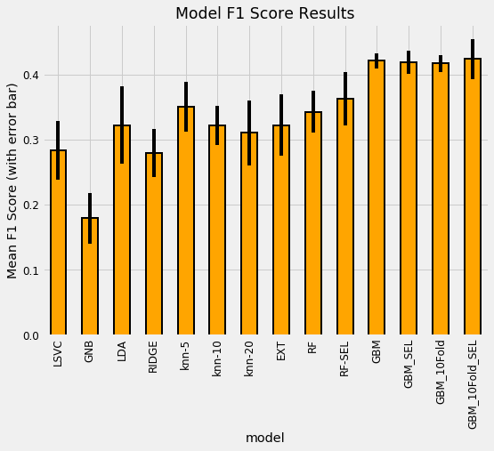
The best model seems to be the Gradient Boosting Machine trained with 10 folds on the selected features. This model has not yet been optimized, but we might be able to get a little more performance through optimization.
print(f"There are {gbm_fi_selected[gbm_fi_selected['importance'] == 0].shape[0]} features with no importance.")
There are 0 features with no importance.
All of the features we are using have some importance to the Gradient Boosting Machine.
So, the next step to take is Model Optimization, to get the most from a machine learning model.
Model Optimization
We will be doing automated optimization because it is generally the most efficient method and can easily be implemented in a number of libraries, including Hyperopt, which uses a modified version of Bayesian Optimization with the Tree Parzen Estimator.
Model Tuning with Hyperopt
Bayesian optimization requires 4 parts:
- Objective function: what we want to maximize (or minimize)
- Domain space: region over which to search
- Algorithm for choosing next hyperparameters: uses past results to suggest next values
- Results history: saves the past results
from hyperopt import hp, tpe, Trials, fmin, STATUS_OK
from hyperopt.pyll.stochastic import sample
import csv
import ast
from timeit import default_timer as timer
1. Objective Function
This takes in the model hyperparameters and returns the associated validation score. Hyperopt needs a score to minimize, so we return 1 - Macro F1 score.
def objective(hyperparameters, nfolds=5):
    """Return validation score from hyperparameters for LightGBM"""

    # Keep track of evals
    global ITERATION
    ITERATION += 1

    # Retrieve the subsample
    subsample = hyperparameters['boosting_type'].get('subsample', 1.0)
    subsample_freq = hyperparameters['boosting_type'].get('subsample_freq', 0)

    boosting_type = hyperparameters['boosting_type']['boosting_type']

    if boosting_type == 'dart':
        hyperparameters['drop_rate'] = hyperparameters['boosting_type']['drop_rate']

    # Subsample and subsample frequency to top level keys
    hyperparameters['subsample'] = subsample
    hyperparameters['subsample_freq'] = subsample_freq
    hyperparameters['boosting_type'] = boosting_type

    # Whether or not to use limit maximum depth
    if not hyperparameters['limit_max_depth']:
        hyperparameters['max_depth'] = -1

    # Make sure parameters that need to be integers are integers
    for parameter_name in ['max_depth', 'num_leaves', 'subsample_for_bin',
                           'min_child_samples', 'subsample_freq']:
        hyperparameters[parameter_name] = int(hyperparameters[parameter_name])

    if 'n_estimators' in hyperparameters:
        del hyperparameters['n_estimators']

    # Using stratified kfold cross validation
    strkfold = StratifiedKFold(n_splits = nfolds, shuffle = True)

    # Convert to arrays for indexing
    features = np.array(train_selected)
    labels = np.array(train_labels).reshape((-1 ))

    valid_scores = []
    best_estimators = []
    run_times = []

    model = lgb.LGBMClassifier(**hyperparameters, class_weight = 'balanced',
                               n_jobs=-1, metric = 'None',
                               n_estimators=10000)

    # Iterate through the folds
    for i, (train_indices, valid_indices) in enumerate(strkfold.split(features, labels)):

        # Training and validation data
        X_train = features[train_indices]
        X_valid = features[valid_indices]
        y_train = labels[train_indices]
        y_valid = labels[valid_indices]

        start = timer()
        # Train with early stopping
        model.fit(X_train, y_train, early_stopping_rounds = 100,
                  eval_metric = macro_f1_score,
                  eval_set = [(X_train, y_train), (X_valid, y_valid)],
                  eval_names = ['train', 'valid'],
                  verbose = 400)
        end = timer()
        # Record the validation fold score
        valid_scores.append(model.best_score_['valid']['macro_f1'])
        best_estimators.append(model.best_iteration_)

        run_times.append(end - start)

    score = np.mean(valid_scores)
    score_std = np.std(valid_scores)
    loss = 1 - score

    run_time = np.mean(run_times)
    run_time_std = np.std(run_times)

    estimators = int(np.mean(best_estimators))
    hyperparameters['n_estimators'] = estimators

    # Write to the csv file ('a' means append)
    of_connection = open(OUT_FILE, 'a')
    writer = csv.writer(of_connection)
    writer.writerow([loss, hyperparameters, ITERATION, run_time, score, score_std])
    of_connection.close()

    # Display progress
    if ITERATION % PROGRESS == 0:
        display(f'Iteration: {ITERATION}, Current Score: {round(score, 4)}.')

    return {'loss': loss, 'hyperparameters': hyperparameters, 'iteration': ITERATION,
            'time': run_time, 'time_std': run_time_std, 'status': STATUS_OK,
            'score': score, 'score_std': score_std}
2. Search Space
The domain is the entire range of values over which we want to search. The only difficult part in here is the subsample ratio which must be set to 1.0 if the boosting_type=”goss”.
# Define the search space
space = {
    'boosting_type': hp.choice('boosting_type',
                              [{'boosting_type': 'gbdt',
                                'subsample': hp.uniform('gdbt_subsample', 0.5, 1),
                                'subsample_freq': hp.quniform('gbdt_subsample_freq', 1, 10, 1)},
                               {'boosting_type': 'dart',
                                 'subsample': hp.uniform('dart_subsample', 0.5, 1),
                                 'subsample_freq': hp.quniform('dart_subsample_freq', 1, 10, 1),
                                 'drop_rate': hp.uniform('dart_drop_rate', 0.1, 0.5)},
                                {'boosting_type': 'goss',
                                 'subsample': 1.0,
                                 'subsample_freq': 0}]),
    'limit_max_depth': hp.choice('limit_max_depth', [True, False]),
    'max_depth': hp.quniform('max_depth', 1, 40, 1),
    'num_leaves': hp.quniform('num_leaves', 3, 50, 1),
    'learning_rate': hp.loguniform('learning_rate',
                                   np.log(0.025),
                                   np.log(0.25)),
    'subsample_for_bin': hp.quniform('subsample_for_bin', 2000, 100000, 2000),
    'min_child_samples': hp.quniform('min_child_samples', 5, 80, 5),
    'reg_alpha': hp.uniform('reg_alpha', 0.0, 1.0),
    'reg_lambda': hp.uniform('reg_lambda', 0.0, 1.0),
    'colsample_bytree': hp.uniform('colsample_by_tree', 0.5, 1.0)
}
sample(space)
{'boosting_type': {'boosting_type': 'goss',
  'subsample': 1.0,
  'subsample_freq': 0},
 'colsample_bytree': 0.868421673676772,
 'learning_rate': 0.026890894083054333,
 'limit_max_depth': True,
 'max_depth': 16.0,
 'min_child_samples': 65.0,
 'num_leaves': 15.0,
 'reg_alpha': 0.6454195098862594,
 'reg_lambda': 0.33909543532343056,
 'subsample_for_bin': 44000.0}
3. Algorithm
The algorithm for choosing the next values is the Tree Parzen Estimator which uses Bayes rule for constructing a surrogate model of the objective function. Instead of maximizing the objective function, the algorithm maximizes the Expected Improvement (EI) of the surrogate model.
algo = tpe.suggest
4. Results History
We’ll use two different methods for recording results:
- Trials object: stores everything returned from the objective function
- Write to a csv file on every iteration
We will use multiple methods for tracking progress because it means redundancy. The csv file can be used to monitor the method while it is running and the Trials object can be saved and then reloaded to resume optimization.
# Record results
trials = Trials()

# Create a file and open a connection
OUT_FILE = 'optimization.csv'
of_connection = open(OUT_FILE, 'w')
writer = csv.writer(of_connection)

MAX_EVALS = 100
PROGRESS = 10
N_FOLDS = 5
ITERATION = 0

# Write column names
headers = ['loss', 'hyperparameters', 'iteration', 'runtime', 'score', 'std']
writer.writerow(headers)
of_connection.close()
%%capture --no-display
display("Running Optimization for {} Trials.".format(MAX_EVALS))

# Run optimization
best = fmin(fn = objective, space = space, algo = tpe.suggest, trials = trials,
            max_evals = MAX_EVALS)
'Running Optimization for 100 Trials.'


'Iteration: 10, Current Score: 0.4263.'


'Iteration: 20, Current Score: 0.4381.'


'Iteration: 30, Current Score: 0.4337.'


'Iteration: 40, Current Score: 0.4221.'


'Iteration: 50, Current Score: 0.4216.'


'Iteration: 60, Current Score: 0.4434.'


'Iteration: 70, Current Score: 0.4314.'


'Iteration: 80, Current Score: 0.4267.'


'Iteration: 90, Current Score: 0.4397.'


'Iteration: 100, Current Score: 0.4238.'
To resume training, we can pass in the same trials object and increase the max number of iterations. For later use, the trials can be saved as json.
import json

# Save the trial results
with open('trials.json', 'w') as f:
    f.write(json.dumps(str(trials)))
Using Optimized Model
The optimization procedure has finished, now we can use the best results for modeling.
results = pd.read_csv(OUT_FILE).sort_values('loss', ascending = True).reset_index()
results.head()
| index | loss | hyperparameters | iteration | runtime | score | std | |
|---|---|---|---|---|---|---|---|
| 0 | 80 | 0.550886 | {'boosting_type': 'dart', 'colsample_bytree': ... | 81 | 10.904898 | 0.449114 | 0.008057 |
| 1 | 67 | 0.551097 | {'boosting_type': 'dart', 'colsample_bytree': ... | 68 | 9.232835 | 0.448903 | 0.008709 |
| 2 | 25 | 0.554674 | {'boosting_type': 'dart', 'colsample_bytree': ... | 26 | 5.199798 | 0.445326 | 0.014654 |
| 3 | 74 | 0.556196 | {'boosting_type': 'dart', 'colsample_bytree': ... | 75 | 9.473914 | 0.443804 | 0.013109 |
| 4 | 59 | 0.556569 | {'boosting_type': 'dart', 'colsample_bytree': ... | 60 | 13.481497 | 0.443431 | 0.007912 |
plt.figure(figsize = (8, 6))
sns.regplot('iteration', 'score', data = results);
plt.title("Optimization Scores");
plt.xticks(list(range(1, results['iteration'].max() + 1, 3)));
C:\Anaconda\lib\site-packages\scipy\stats\stats.py:1713: FutureWarning: Using a non-tuple sequence for multidimensional indexing is deprecated; use `arr[tuple(seq)]` instead of `arr[seq]`. In the future this will be interpreted as an array index, `arr[np.array(seq)]`, which will result either in an error or a different result.
  return np.add.reduce(sorted[indexer] * weights, axis=axis) / sumval
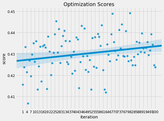
# The best hyperparameter for the model
best_hyp = ast.literal_eval(results.loc[0, 'hyperparameters'])
best_hyp
{'boosting_type': 'dart',
 'colsample_bytree': 0.9233397304086874,
 'learning_rate': 0.1792933287795563,
 'limit_max_depth': False,
 'max_depth': -1,
 'min_child_samples': 55,
 'num_leaves': 37,
 'reg_alpha': 0.3682628328736705,
 'reg_lambda': 0.4418140782167804,
 'subsample_for_bin': 82000,
 'drop_rate': 0.2812416964275643,
 'subsample': 0.6193333539993814,
 'subsample_freq': 4,
 'n_estimators': 129}
%%capture --no-display
submission, gbm_fi, valid_scores = model_gbm(train_selected, train_labels,
                                             test_selected, test_ids,
                                             nfolds = 10, return_preds=False)

model_results = model_results.append(pd.DataFrame({'model': ["GBM_OPT_10Fold_SEL"],
                                                   'cv_mean': [valid_scores.mean()],
                                                   'cv_std':  [valid_scores.std()]}),
                                    sort = True).sort_values('cv_mean', ascending = False)
'Fold 1, Validation Score: 0.46192, Estimators Trained: 14'


'Fold 2, Validation Score: 0.38851, Estimators Trained: 27'


'Fold 3, Validation Score: 0.44493, Estimators Trained: 106'


'Fold 4, Validation Score: 0.41606, Estimators Trained: 1'


'Fold 5, Validation Score: 0.42422, Estimators Trained: 32'


'Fold 6, Validation Score: 0.38413, Estimators Trained: 10'


'Fold 7, Validation Score: 0.41178, Estimators Trained: 3'


'Fold 8, Validation Score: 0.41151, Estimators Trained: 5'


'Fold 9, Validation Score: 0.45182, Estimators Trained: 93'


'Fold 10, Validation Score: 0.42257, Estimators Trained: 151'


'10 cross validation score: 0.42175 with std: 0.02412.'
%%capture --no-display
submission, gbm_fi, valid_scores = model_gbm(train_set, train_labels,
                                             test_set, test_ids,
                                             nfolds = 10, return_preds=False)

model_results = model_results.append(pd.DataFrame({'model': ["GBM_OPT_10Fold"],
                                                   'cv_mean': [valid_scores.mean()],
                                                   'cv_std':  [valid_scores.std()]}),
                                    sort = True).sort_values('cv_mean', ascending = False)
'Fold 1, Validation Score: 0.44995, Estimators Trained: 282'


'Fold 2, Validation Score: 0.41986, Estimators Trained: 7'


'Fold 3, Validation Score: 0.43577, Estimators Trained: 42'


'Fold 4, Validation Score: 0.44079, Estimators Trained: 21'


'Fold 5, Validation Score: 0.42605, Estimators Trained: 1'


'Fold 6, Validation Score: 0.40115, Estimators Trained: 19'


'Fold 7, Validation Score: 0.36243, Estimators Trained: 6'


'Fold 8, Validation Score: 0.39892, Estimators Trained: 85'


'Fold 9, Validation Score: 0.4503, Estimators Trained: 5'


'Fold 10, Validation Score: 0.4112, Estimators Trained: 10'


'10 cross validation score: 0.41964 with std: 0.02593.'
model_results.head()
| cv_mean | cv_std | model | |
|---|---|---|---|
| 13 | 0.423700 | 0.030838 | GBM_10Fold_SEL |
| 0 | 0.421746 | 0.024122 | GBM_OPT_10Fold_SEL |
| 10 | 0.420502 | 0.011568 | GBM |
| 0 | 0.419642 | 0.025929 | GBM_OPT_10Fold |
| 11 | 0.418114 | 0.017533 | GBM_SEL |
submission.to_csv('gbm_opt_10fold_selected.csv', index = False)
Now we will be investigating the predictions to see where our model is wrong.
_ = feature_importances_plot(gbm_fi)
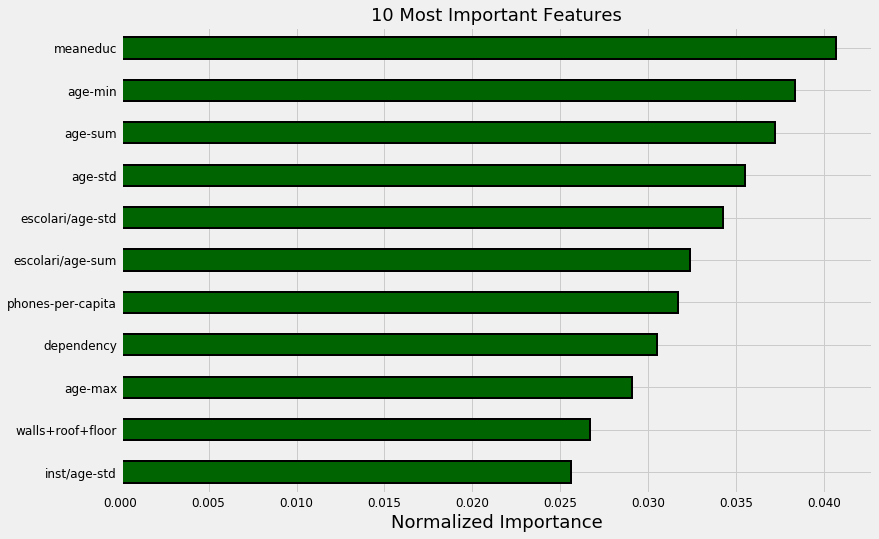
Here we can see that the most important fetures.
Investigate Predictions
As a first attempt at looking into our model, we can visualize the distribution of predicted labels on the test data. We would expect these to show the same distribution as on the training data. Since we are concerned with household predictions, we’ll look at only the predictions for each house and compare with that in the training data.
The following histrograms are normalize meaning that they show the relative frequency instead of the absolute counts. This is necessary because the raw counts differ in the training and testing data.
preds = submission_base.merge(submission, on = 'Id', how = 'left')
preds = pd.DataFrame(preds.groupby('idhogar')['Target'].mean())

# Plot the training labels distribution
fig, axes = plt.subplots(1, 2, sharey = True, figsize = (12, 6))
heads['Target'].sort_index().plot.hist(normed = True,
                                       edgecolor = r'k',
                                       linewidth = 2,
                                       ax = axes[0])

axes[0].set_xticks([1, 2, 3, 4]);
axes[0].set_xticklabels(poverty_mapping.values(), rotation = 60)
axes[0].set_title('Train Label Distribution')

# Plot the predicted labels
preds['Target'].sort_index().plot.hist(normed = True,
                                       edgecolor = 'k',
                                       linewidth = 2,
                                       ax = axes[1])
axes[1].set_xticks([1, 2, 3, 4]);
axes[1].set_xticklabels(poverty_mapping.values(), rotation = 60)
plt.subplots_adjust()
plt.title('Predicted Label Distribution');
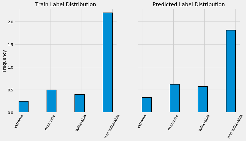
heads['Target'].value_counts()
4.0    1954
2.0     442
3.0     355
1.0     222
Name: Target, dtype: int64
preds['Target'].value_counts()
4    3997
2    1370
3    1250
1     735
Name: Target, dtype: int64
The predicted distribution looks close to the training distribution although there are some differences. The 4s are underrepresented in the predictions and the 3s are overrepresented.
Validation
For the test predictions, we can only compare the distribution with that found on the training data. If we want to compare predictions to actual answers, we’ll have to split the training data into a separate validation set. We’ll use 1000 examples for testing and then we can do operations like make the confusion matrix because we have the right answer.
from sklearn.model_selection import train_test_split

# Split into validation set
X_train, X_valid, y_train, y_valid = train_test_split(train_selected,
                                                      train_labels,
                                                      test_size = 1000,
                                                      random_state = 10)

# Create model and train
model = lgb.LGBMClassifier(**best_hyp,
                           class_weight = 'balanced',
                           random_state = 10)
model.fit(X_train, y_train);
# Make validation predictions
valid_preds = model.predict_proba(X_valid)
preds_df = pd.DataFrame(valid_preds, columns = [1, 2, 3, 4])

# Convert into predictions
preds_df['prediction'] = preds_df[[1, 2, 3, 4]].idxmax(axis = 1)
preds_df['confidence'] = preds_df[[1, 2, 3, 4]].max(axis = 1)

preds_df.head()
| 1 | 2 | 3 | 4 | prediction | confidence | |
|---|---|---|---|---|---|---|
| 0 | 0.106973 | 0.068677 | 0.084616 | 0.739733 | 4 | 0.739733 |
| 1 | 0.035056 | 0.027228 | 0.018314 | 0.919402 | 4 | 0.919402 |
| 2 | 0.045279 | 0.091107 | 0.489562 | 0.374053 | 3 | 0.489562 |
| 3 | 0.298444 | 0.344762 | 0.314599 | 0.042195 | 2 | 0.344762 |
| 4 | 0.034340 | 0.197296 | 0.681431 | 0.086933 | 3 | 0.681431 |
print('F1 score:', round(f1_score(y_valid, preds_df['prediction'], average = 'macro'), 5))
F1 score: 0.41232
Let’s use our predictions to plot a confusion matrix. This lets us see where the model is “confused” by showing the differences between predictions and true values.
# The package to plot confusion matrix
from costarican.confusionPlot import confusion_matrix_plot
from sklearn.metrics import confusion_matrix
cm = confusion_matrix(y_valid, preds_df['prediction'])

confusion_matrix_plot(cm, classes = ['Extreme', 'Moderate', 'Vulnerable', 'Non-Vulnerable'],
                      title = 'Poverty Confusion Matrix')
Confusion matrix, without normalization
[[ 28  23  14  15]
 [ 28  54  35  22]
 [ 18  29  33  33]
 [ 34  64 100 470]]
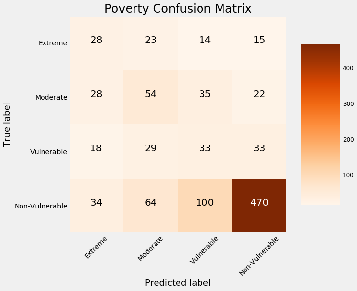
Here we can see that any of the values on the diagonal, the model got correct because the predicted value matches the true value. Anything not on the diagonal our model got wrong which we can assess by looking at the predicted value versus the actual value.
Here, we see that our model is only very accurate at idenifying the non-vulnerable households.
To look at the percentage of each true label predicted in each class, we can normalize the confusion matrix for the true labels.
confusion_matrix_plot(cm, normalize = True,
                      classes = ['Extreme', 'Moderate', 'Vulnerable', 'Non-Vulnerable'],
                      title = 'Poverty Confusion Matrix')
Normalized confusion matrix
[[0.35       0.2875     0.175      0.1875    ]
 [0.20143885 0.38848921 0.25179856 0.15827338]
 [0.15929204 0.25663717 0.2920354  0.2920354 ]
 [0.0508982  0.09580838 0.1497006  0.70359281]]
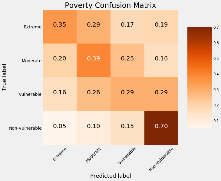
Now we can see that our model really does not do that well for classes other than Non Vulnerable. It only correctly identifies 15% of the Vulnerable households, classifying more of them as moderate or non vulnerable. Overall, these results show that imbalanced classification problems with relatively few observations are very difficult. There are some methods we can take to try and counter this such as oversampling or training multiple models on different sections of the data, but at the end of the day, the most effective method may be to gather more data.
Conclusion
So now social programs will not have a hard time making sure the right people are given enough aid and now the program can focus on the poorest segment of the population.
For those interested, the Jupyter Notebook with all the code can be found in the Github repository for this post.
Leave a Comment